Client
Wordmark
Industry
Startups
Services
Identity Design, UI Design
Year
2021
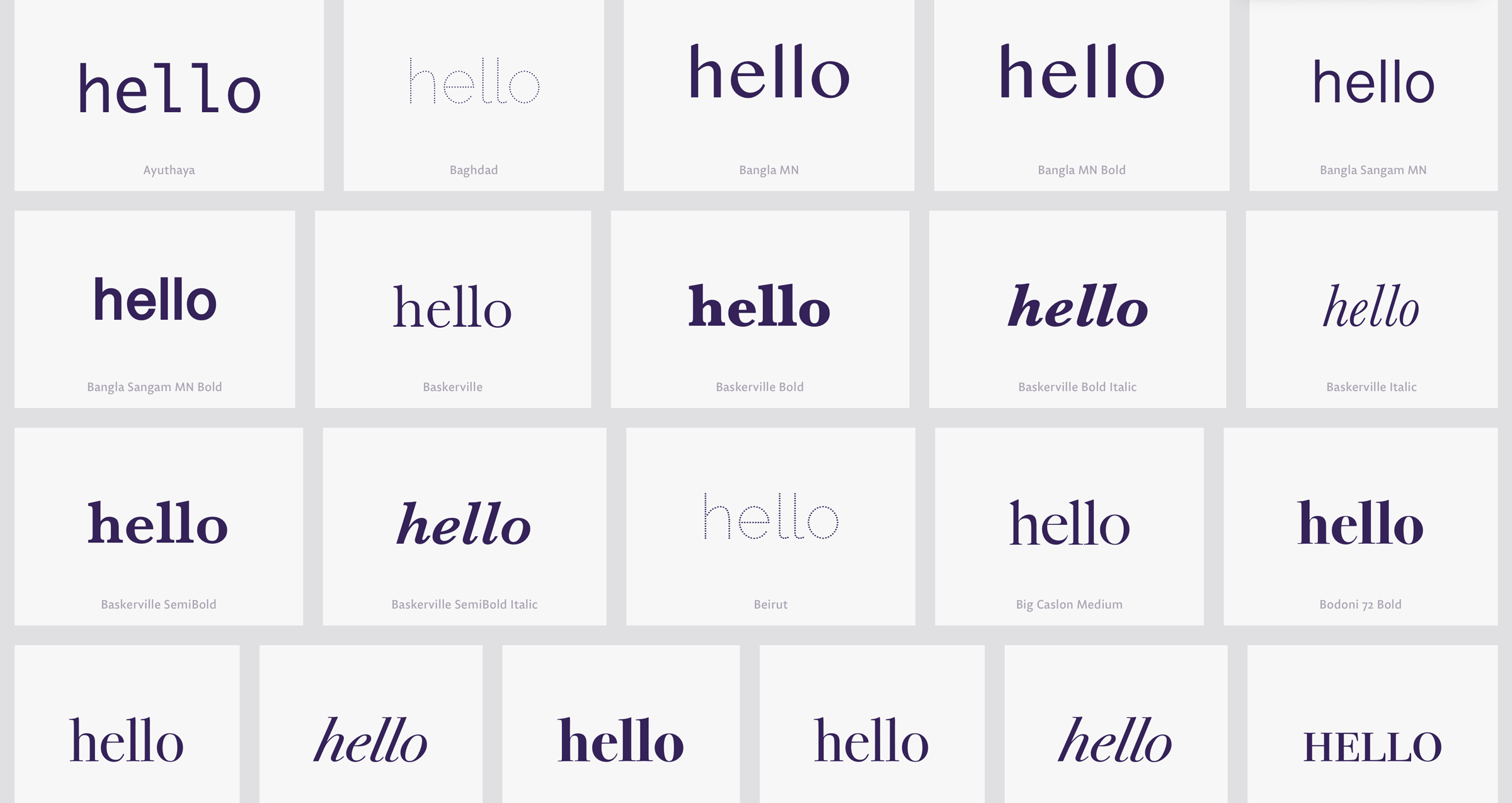
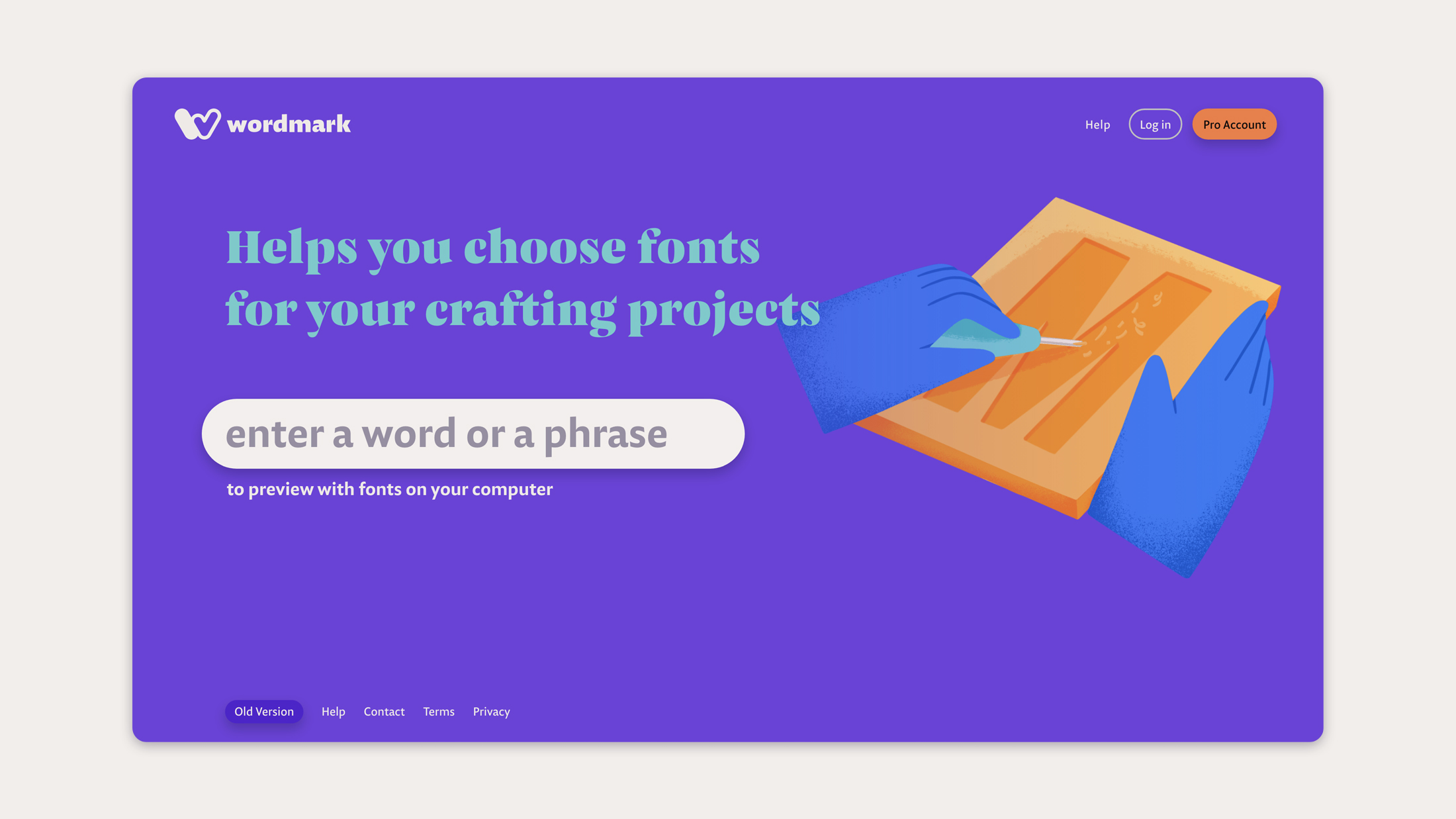
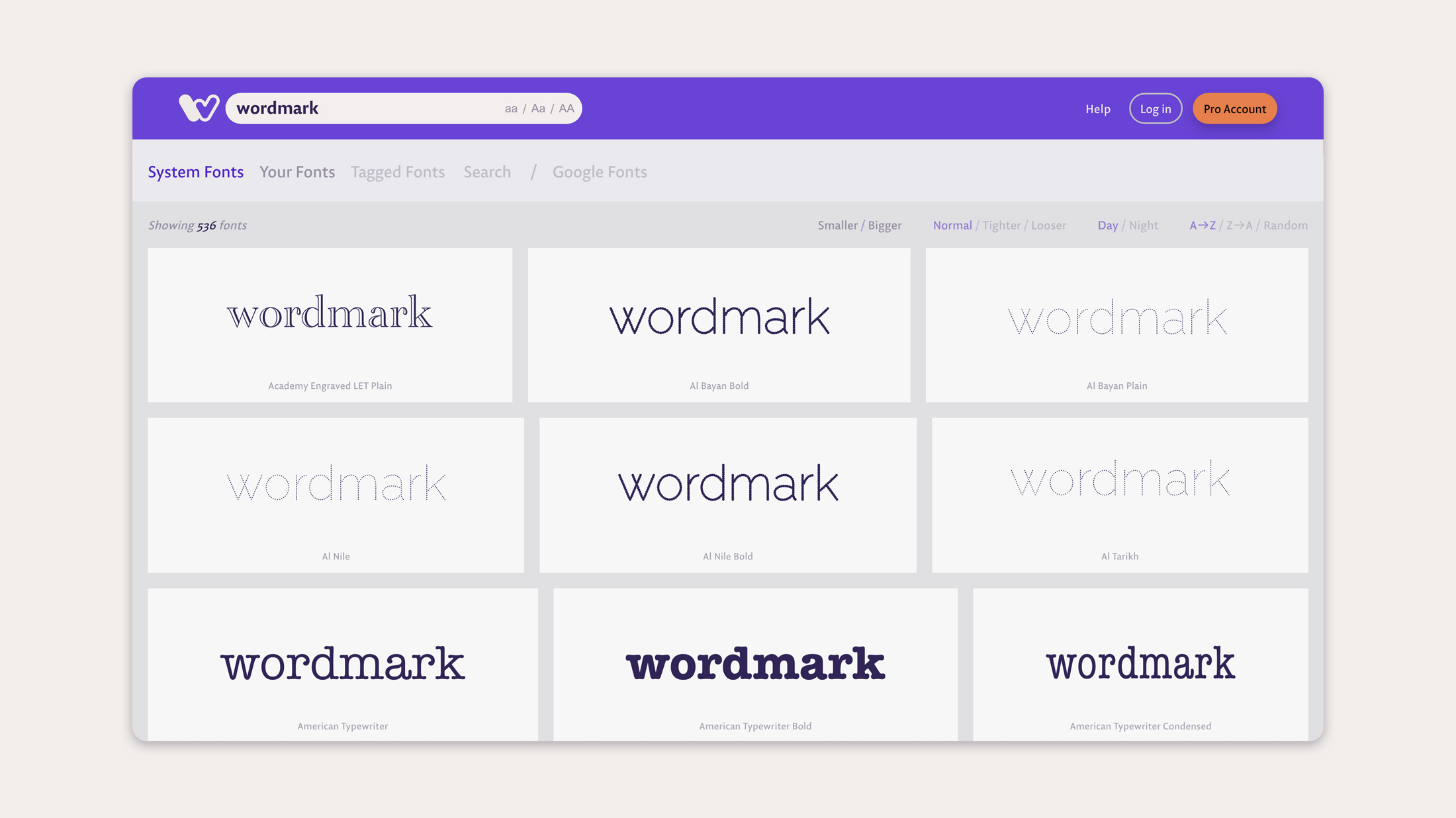
Have you ever found yourself squinting at a list of fonts, in a drop-down menu, trying to find the right font for the job? Only to find out that the font that you picked doesn’t even look good with your text? Wordmark shows your text with all your fonts, arranged in a visual grid, allowing you to compare and pick the best one.
After analyzing the profiles of Wordmark users, application areas, and their feedback, we decided that a warm and humanist language would be appropriate.
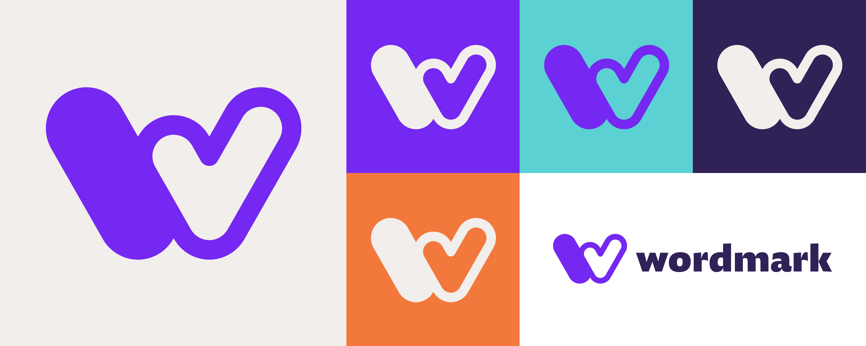
Considering what Wordmark is, a simple, bold, symbolic, and typographic solution was created: Wordmark’s first letter ‘w’ merges with the tick mark, and a catchy symbol emerges that works in all different sizes and applications.
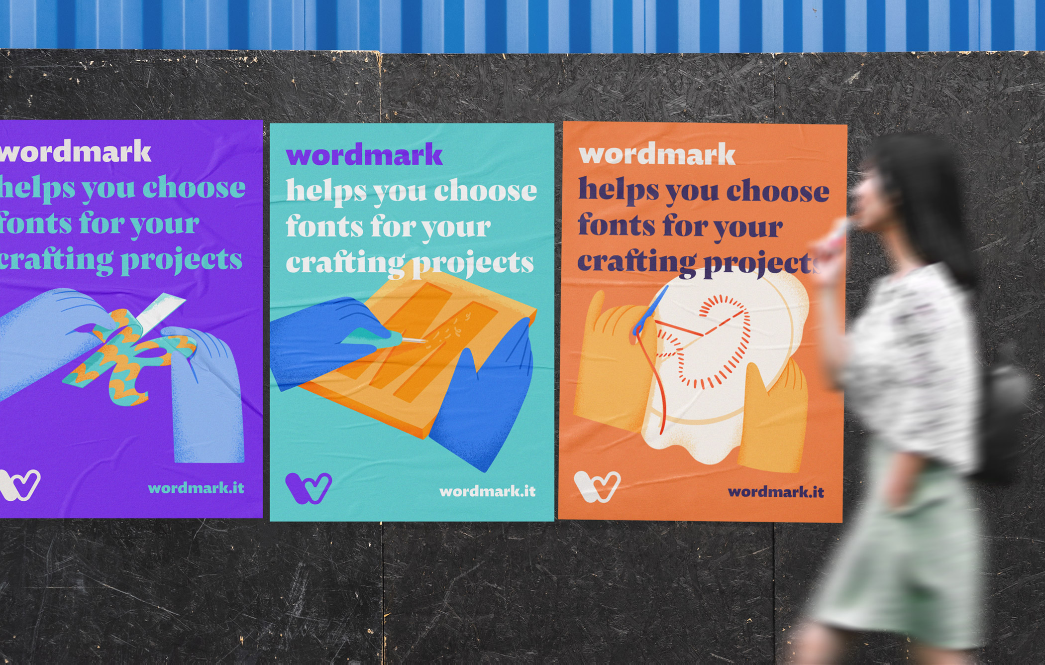
The Hands
After surveys and feedback from users, it was revealed that Wordmark users mostly used the application for handicrafts. We wanted to incorporate this information into the identity, and that’s how the idea of hands reflecting differences and diversity emerged. We teamed up with Selin Tahtakılıç for creating illustrations of hands producing the letters that make up the word “wordmark” using different techniques.

Typography, Colors, and UI
In line with the information about Wordmark’s users and the message it wants to give, a humanist font family was preferred. The Pensum family with both sans-serif and display serif fonts was our choice. The expressive humanistic stance of its skeleton is very suitable for the project and harmonizes well with the identity.
The color palette was also designed to reflect the warm and humanistic personality of the new identity, and to integrate well with the interface of the application.
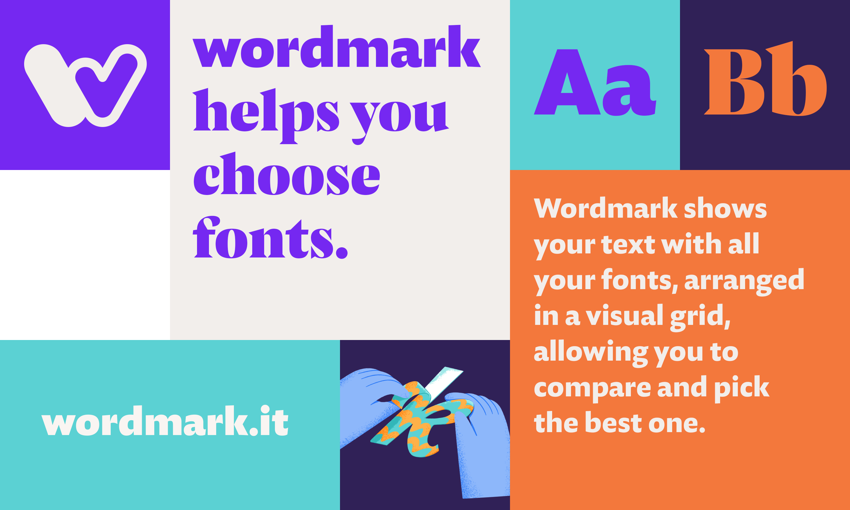
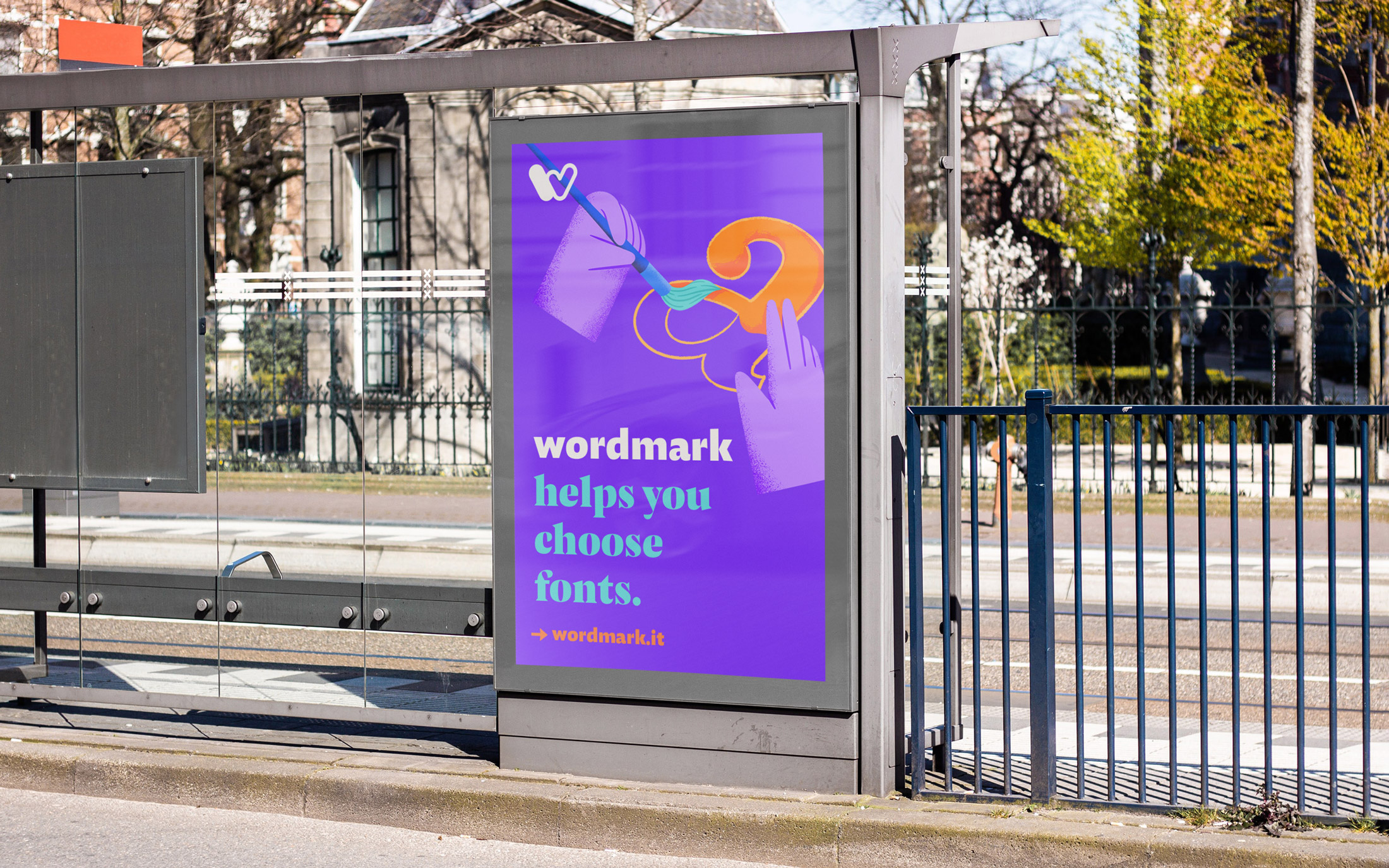
Simplicity and usability come to the fore in the website interface that we developed together with Fahri Özkaramanlı, the founder of the application. Typography, color, and illustration, all reflecting the identity in a coherent unity, welcome the users and guide them in their experience.
WORDS FROM
FAHRİ ÖZKARAMANLI, PROJECT CREATOR & FOUNDER
There was a gap between Wordmark's look and feel and the community of people that integrated it into their workflow. Fevkalade helped us explore the visual language to make our visitors feel at home. With their streamlined approach integrated into our release timeline, we were able to launch the new version of the app while updating our logo, logomark, color palette and user interface supported with a balanced use of typography. Overall, this was a productive and well received collaboration.
We believe in a rational design process where decisions are based on objective reasons that emerge from the project brief and that can be articulated in meaningful and productive discussions.
More about us & our approach →
To discuss a project or collaboration feel free to get in touch.
fevkalade[at]fevkalade.net
All work © 2024 Fevkalade.