Client
Mamut Art Project
Industry
Art Event
Services
Poster Design, Editorial Design, Information Design, Environmental Graphics
Year
2016–2017
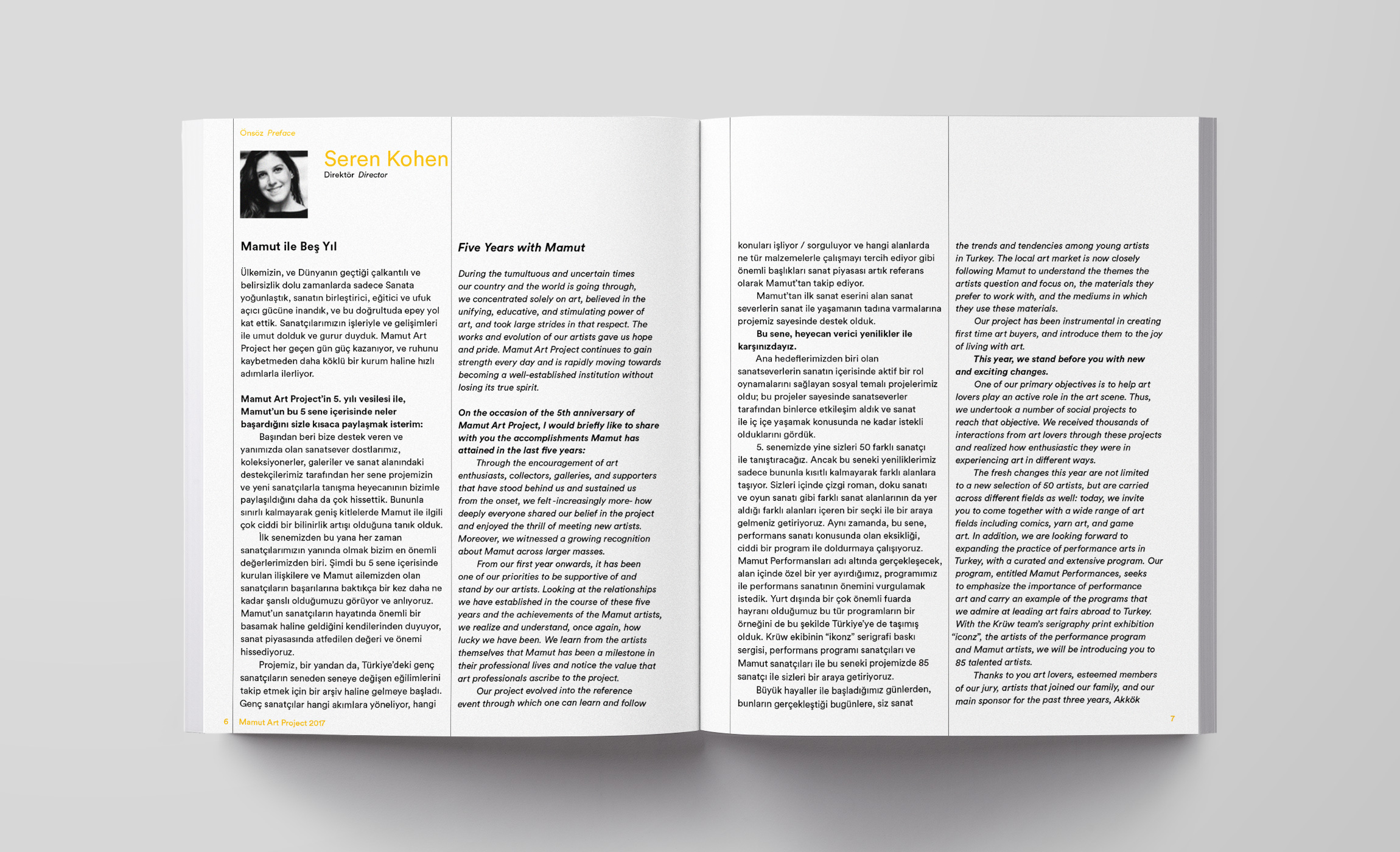
Turkey’s unique art event Mamut Art Project is dedicated to engaging emerging artists with new collectors, galleries and curators, providing an important platform for 50 up-and-coming creative talents working in a range of disciplines throughout Turkey.
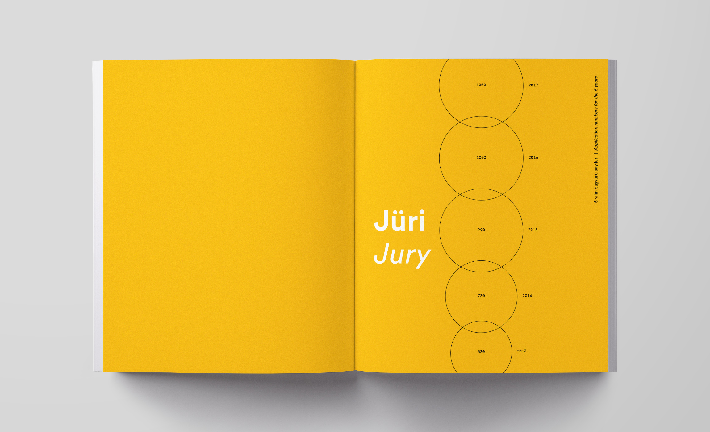
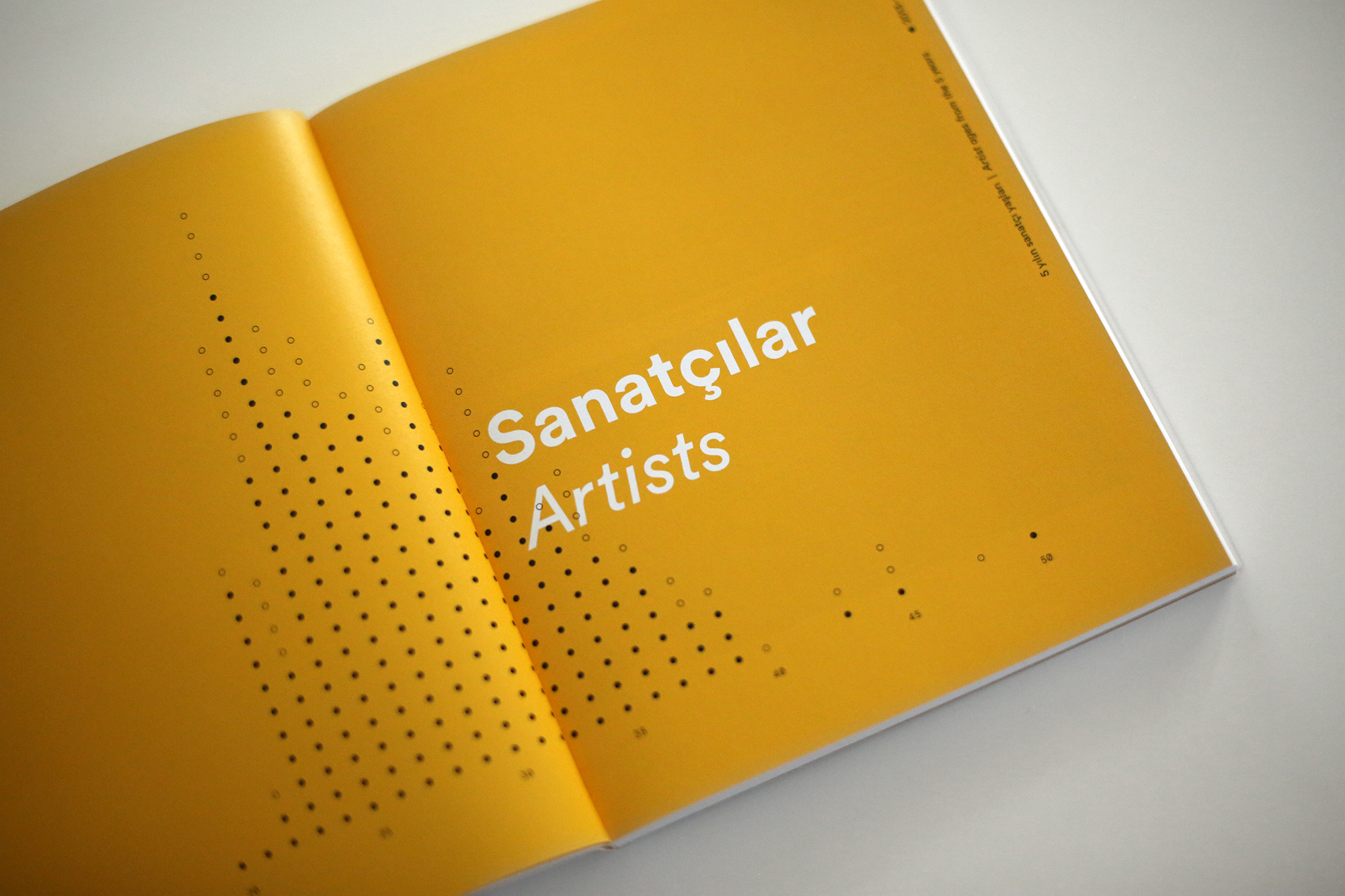
To celebrate their fifth year, Mamut Art Project wanted something special. They also wished to emphasize the facts that their impact was growing and that they always had been welcoming artists from a wide variety of fields, most of which were young and at the beginnings of their careers. Our solution was to construct a visual communication system where visualizations of the data from the five years also function as abstract graphic elements.
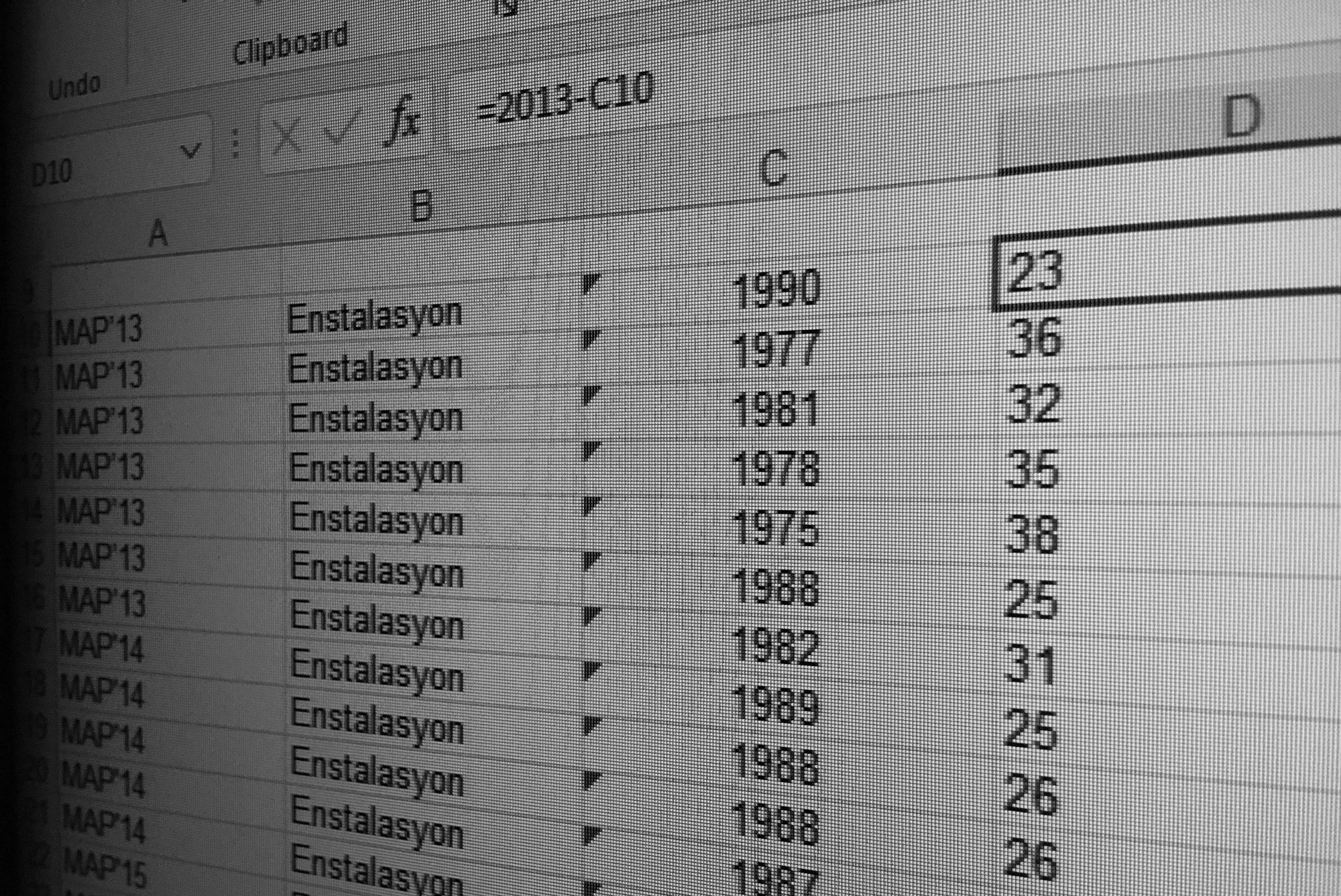
This strategy meant that there was work to be done on the part of the Mamut Art Project team: They gathered as much data as they could about the applications, selected artists and artworks from the past four years and the event year. Then we collated and groomed these data – in the end we had our raw material to start creating our visualizations which would also generate the visual identity of the fifth year’s event.
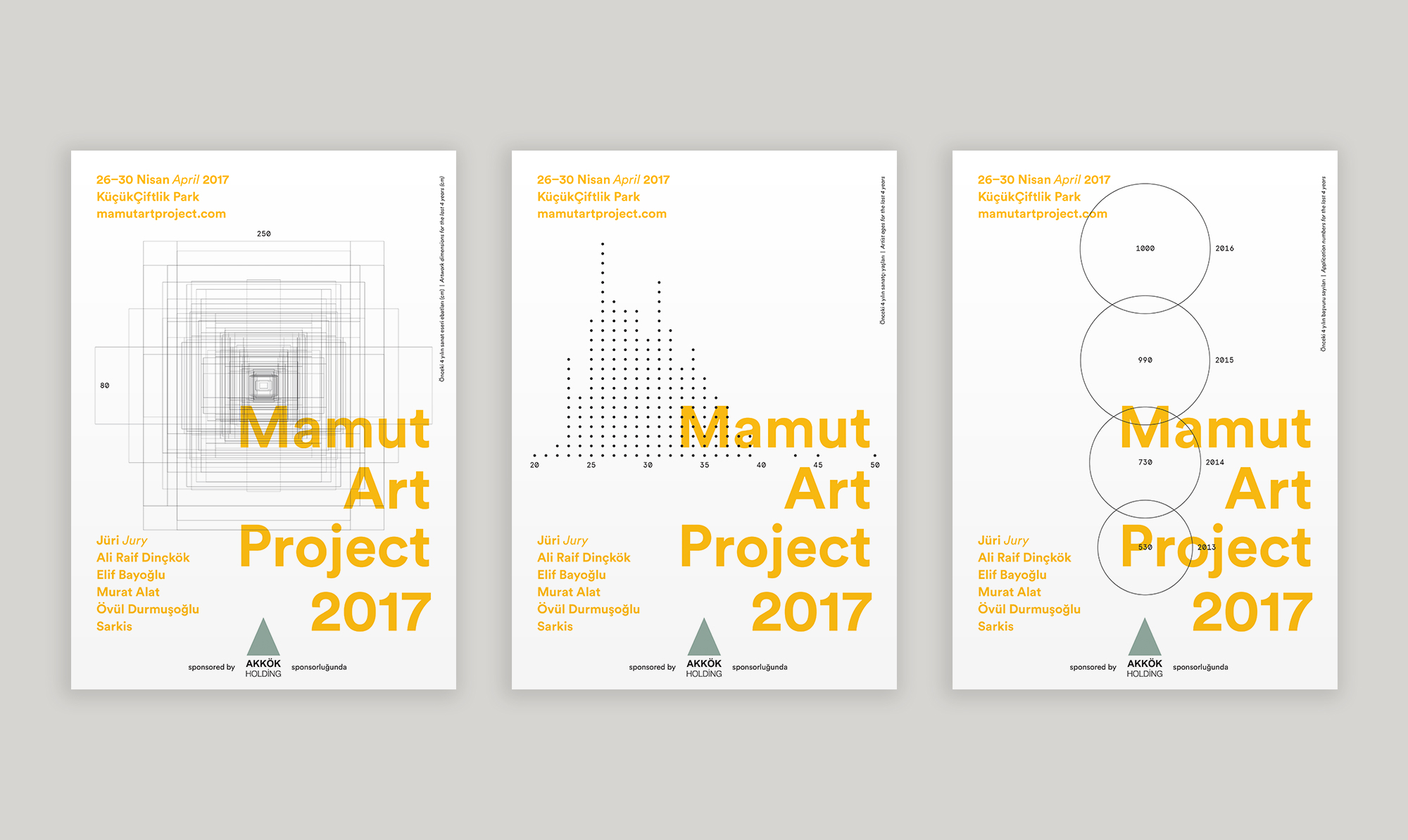
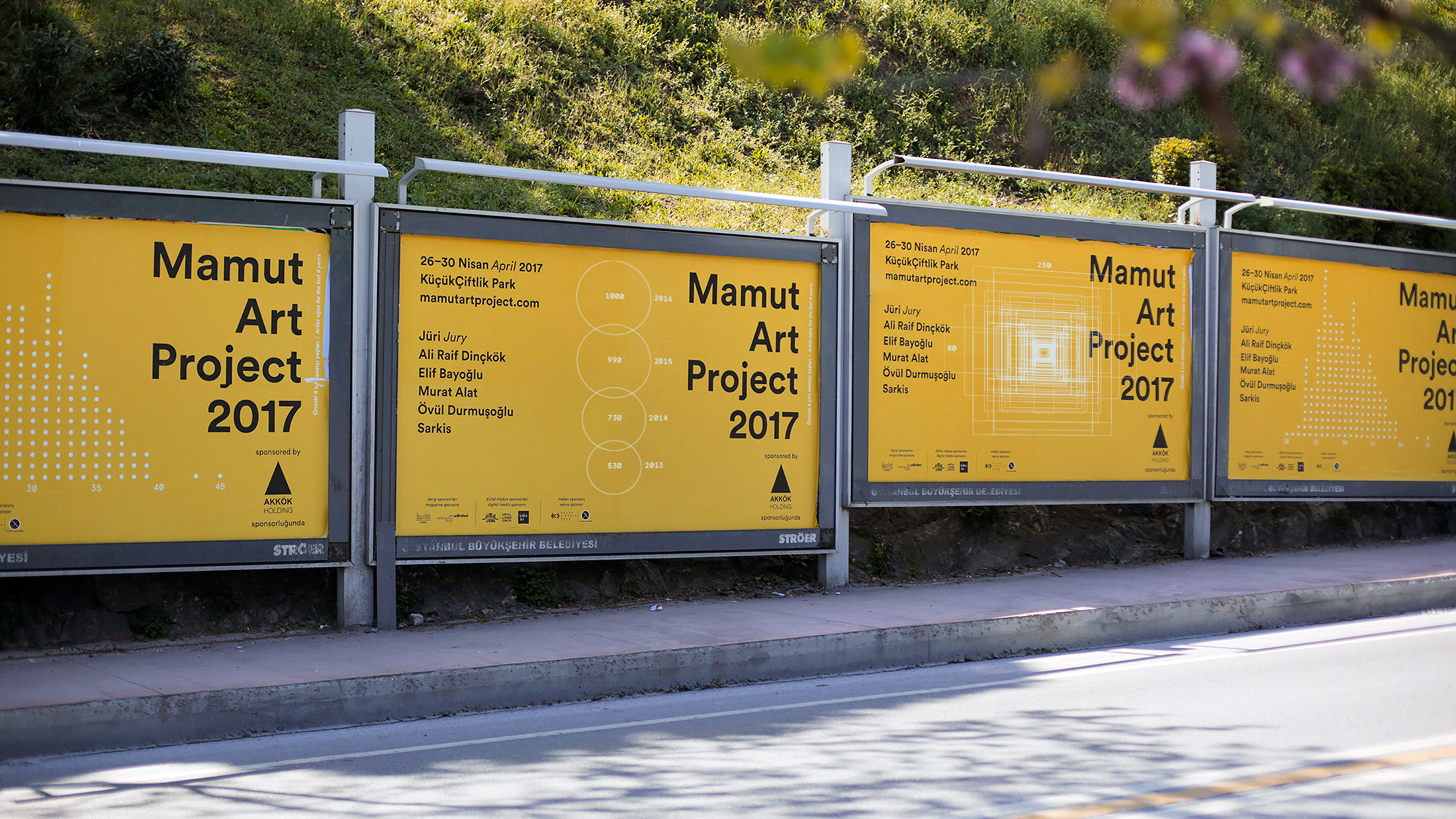
The three posters above respectively show the artwork dimensions, the artist age distributions, and the application numbers from the past four years. Our decision to put the descriptions and the legends of the graphics in the margins of the posters was part of our general strategy about the dual role of these graphics: They were perfectly accurate and readable data visualizations, but they also had the task of forming the visual atmosphere along with the minimalistic typography. Our stance was: “First, get the feel of it. Then, if you’re curious enough, you’ll find the explanation in the margin.” It was like an Easter egg.
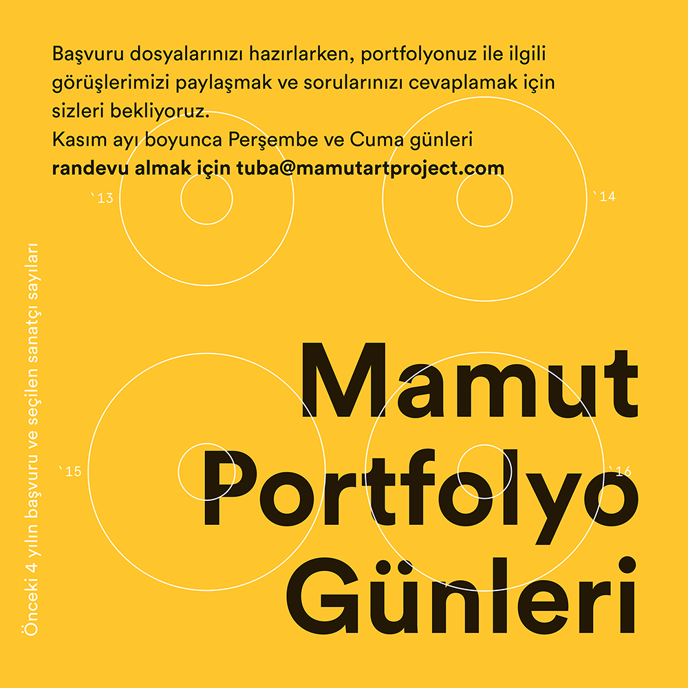
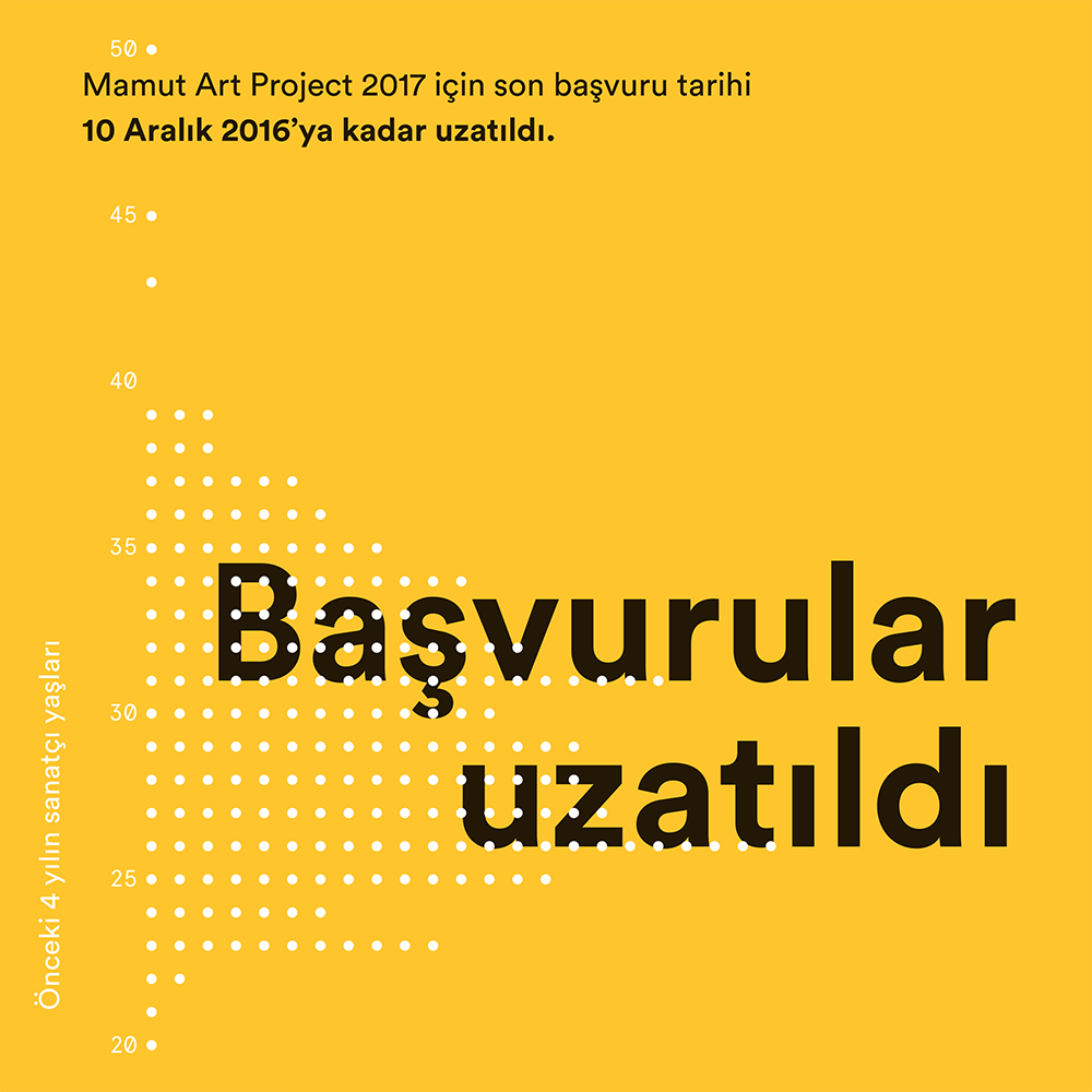
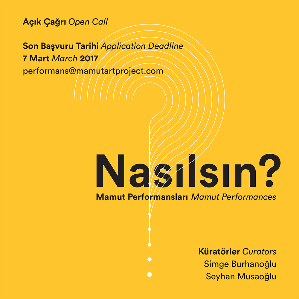

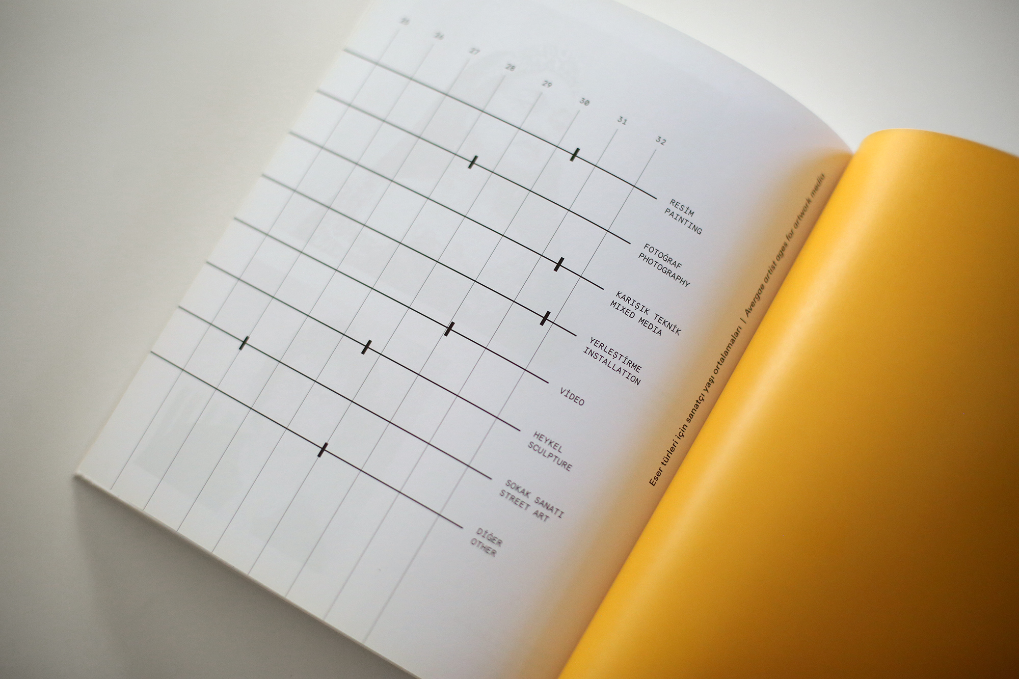
The data graphics created for its fifth year communicate many important facts about Mamut Art Project: its growing impact, its diversity in terms of artwork types, and its emphasis on promoting young artists.
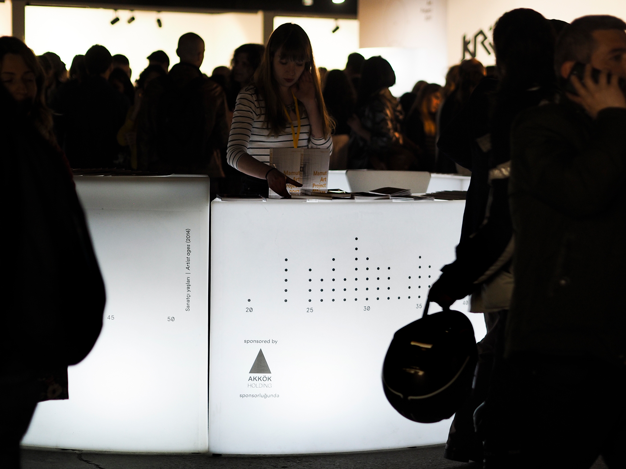
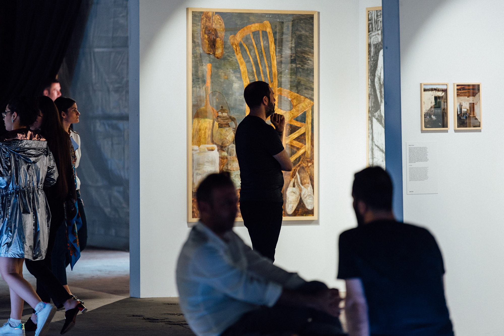
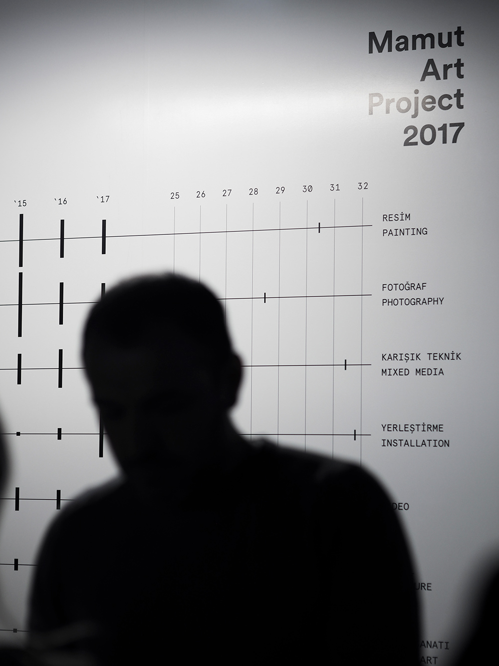
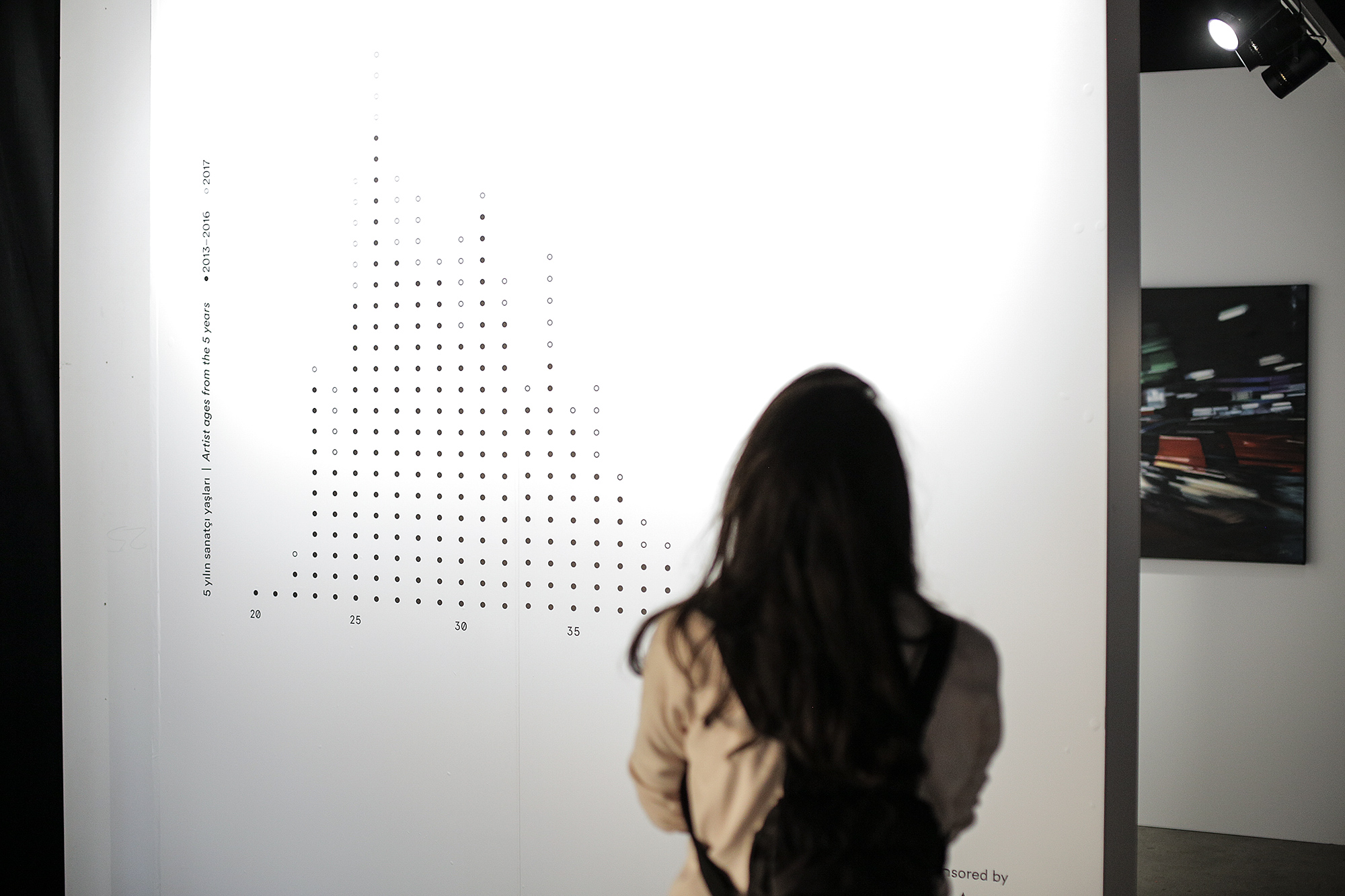
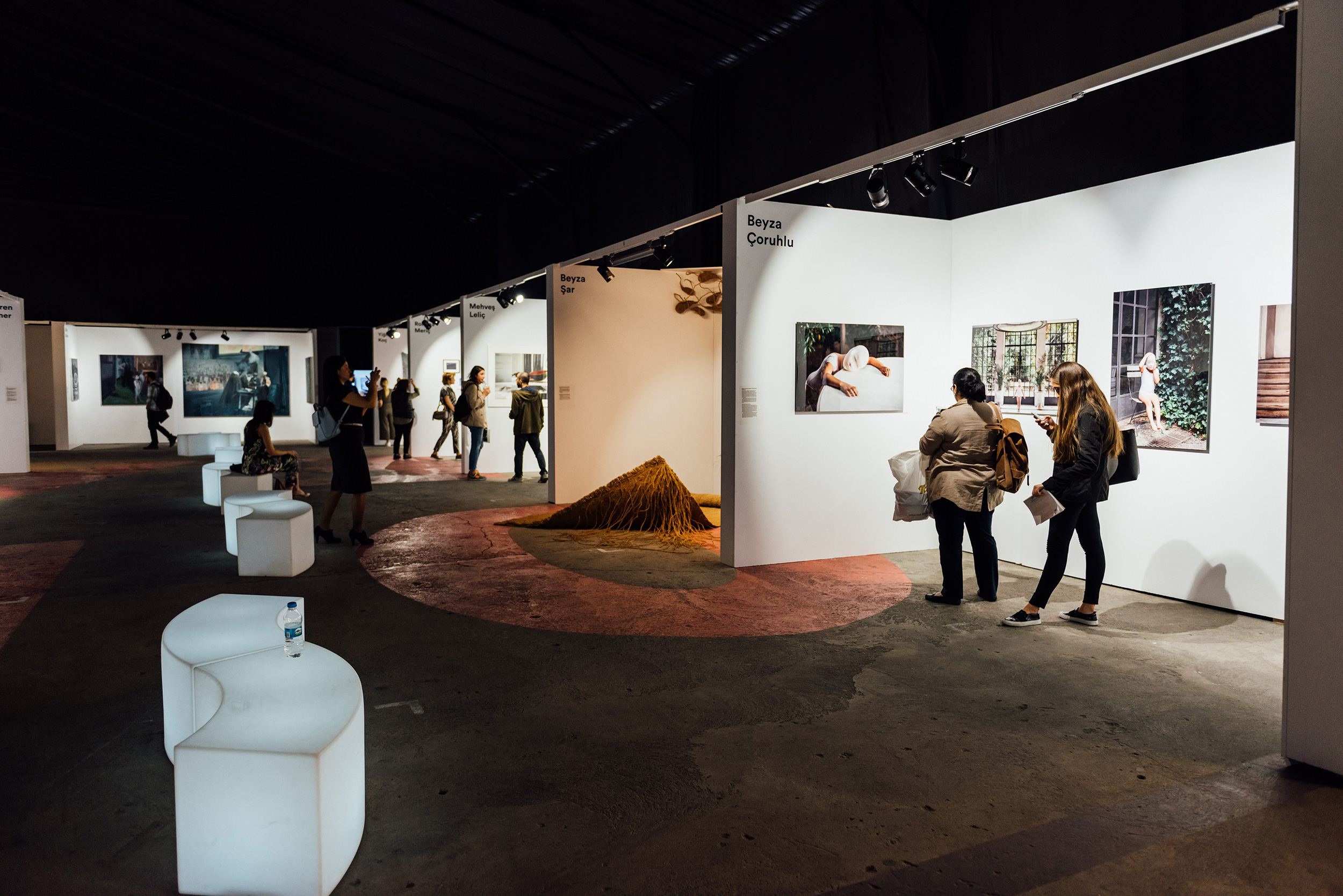
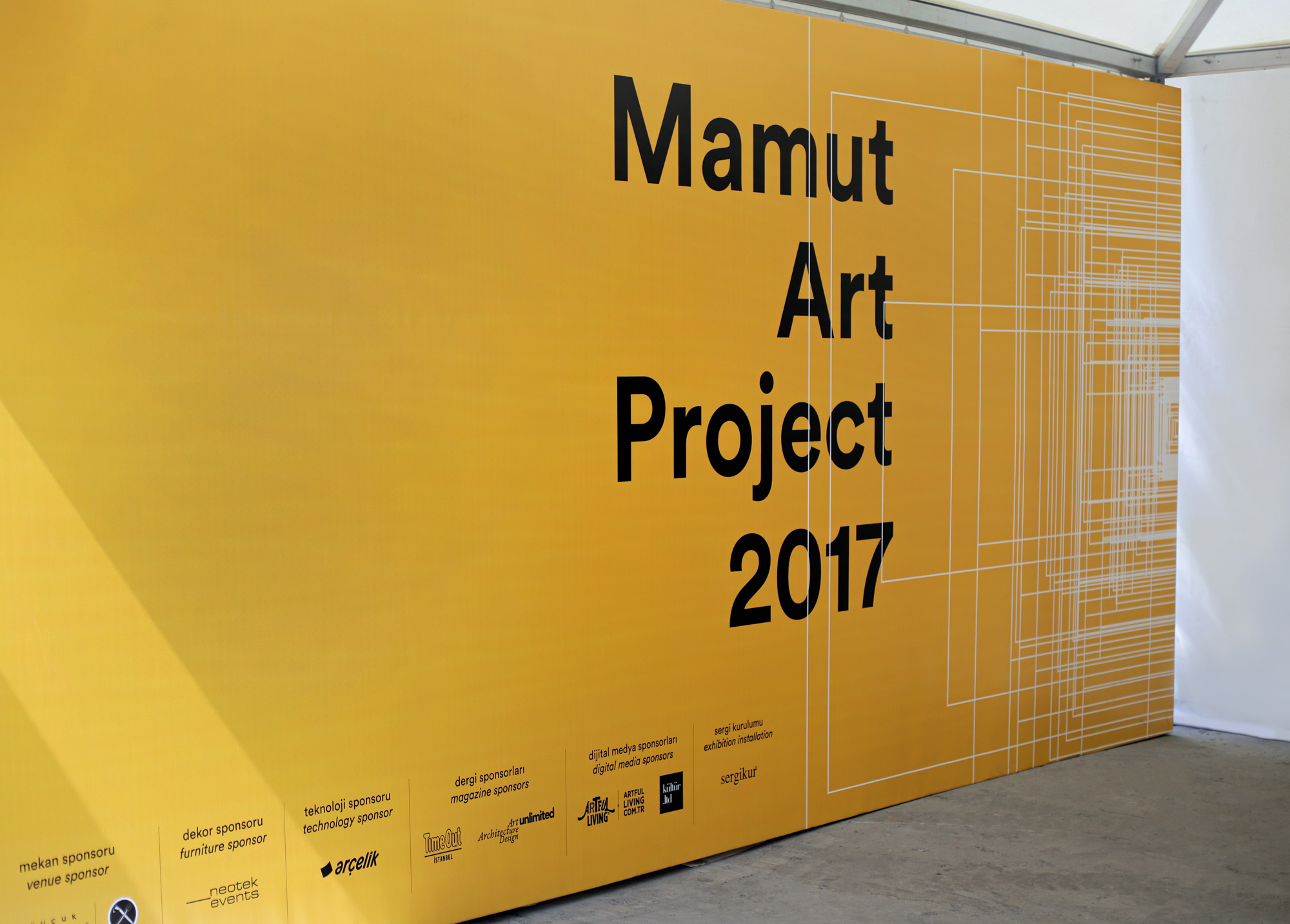
For the environmental graphics, we took a more direct approach and “exhibited” the data visualizations on some of the separator walls, without getting too close to the artworks. We didn’t miss the chance of printing our graphic showing artwork sizes from past years in 1:1 scale since we had this large enough wall.
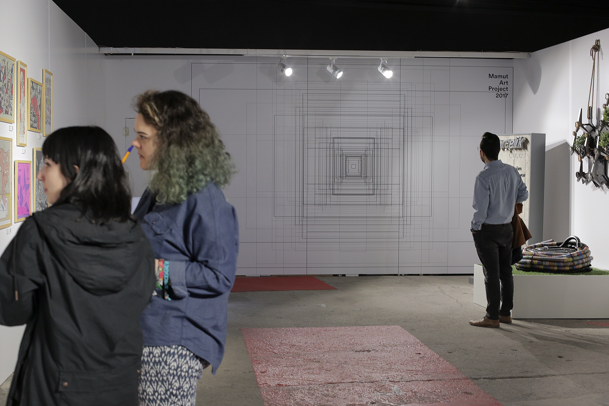
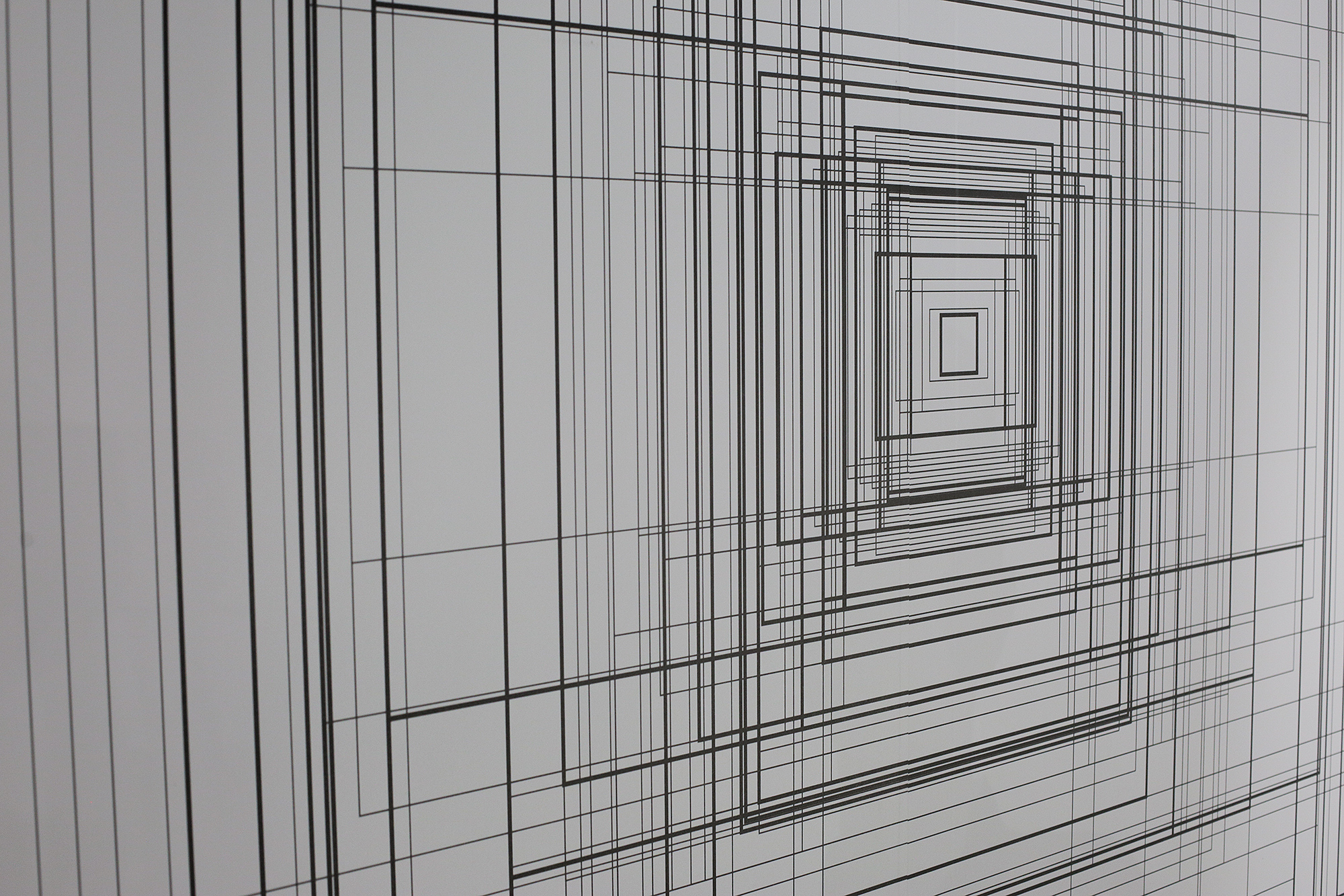
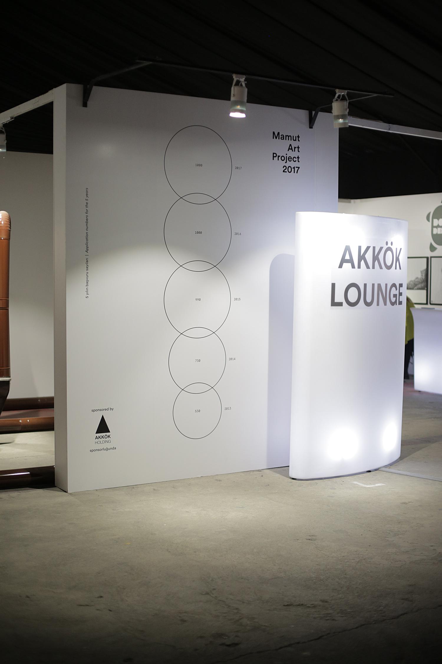
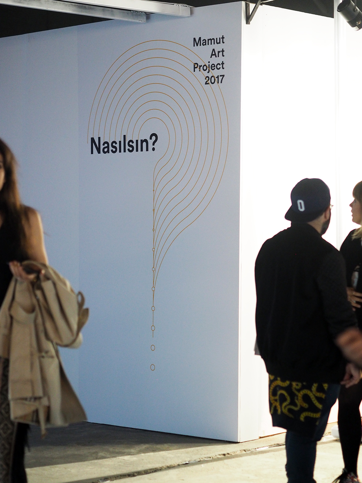
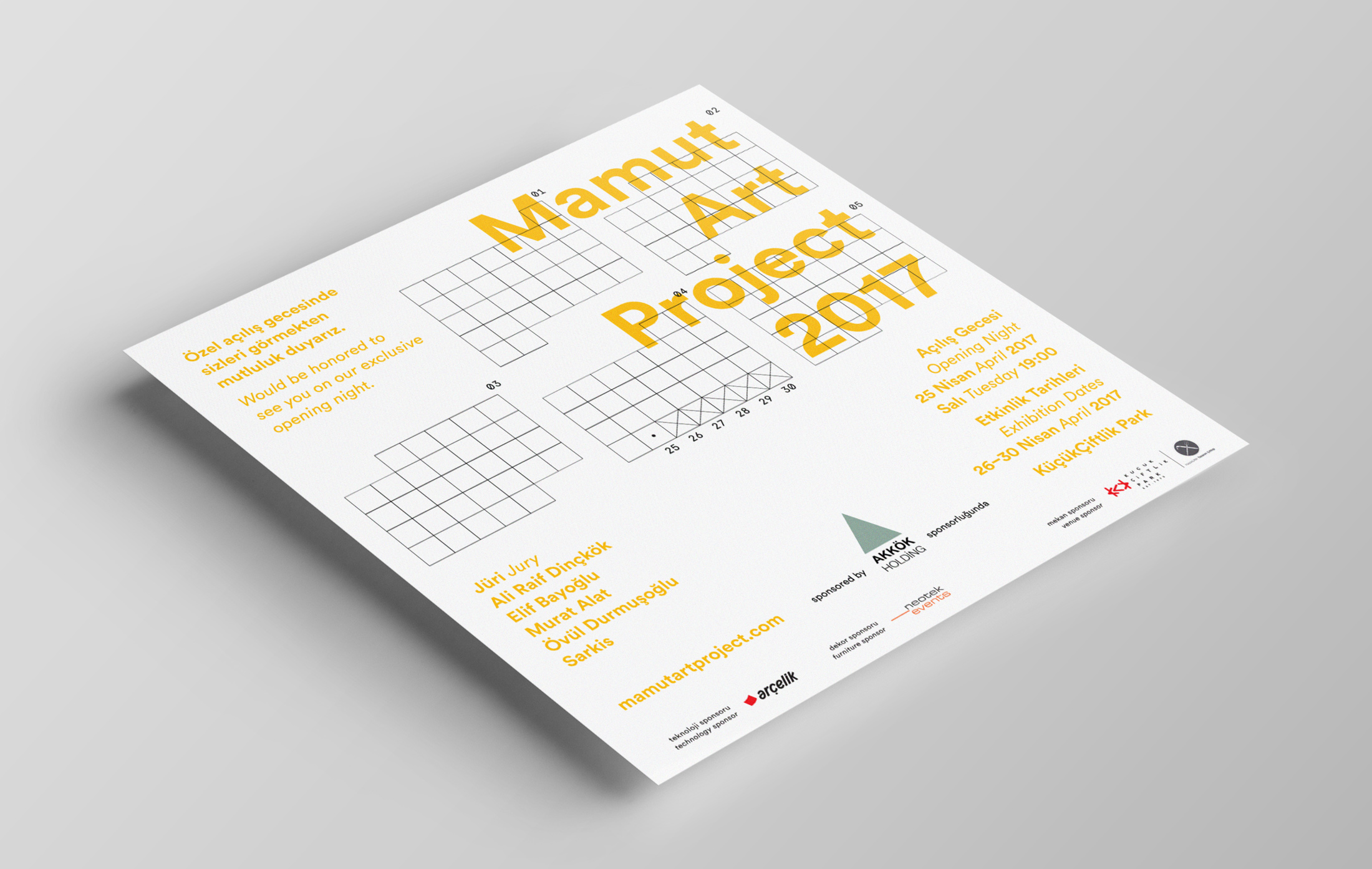
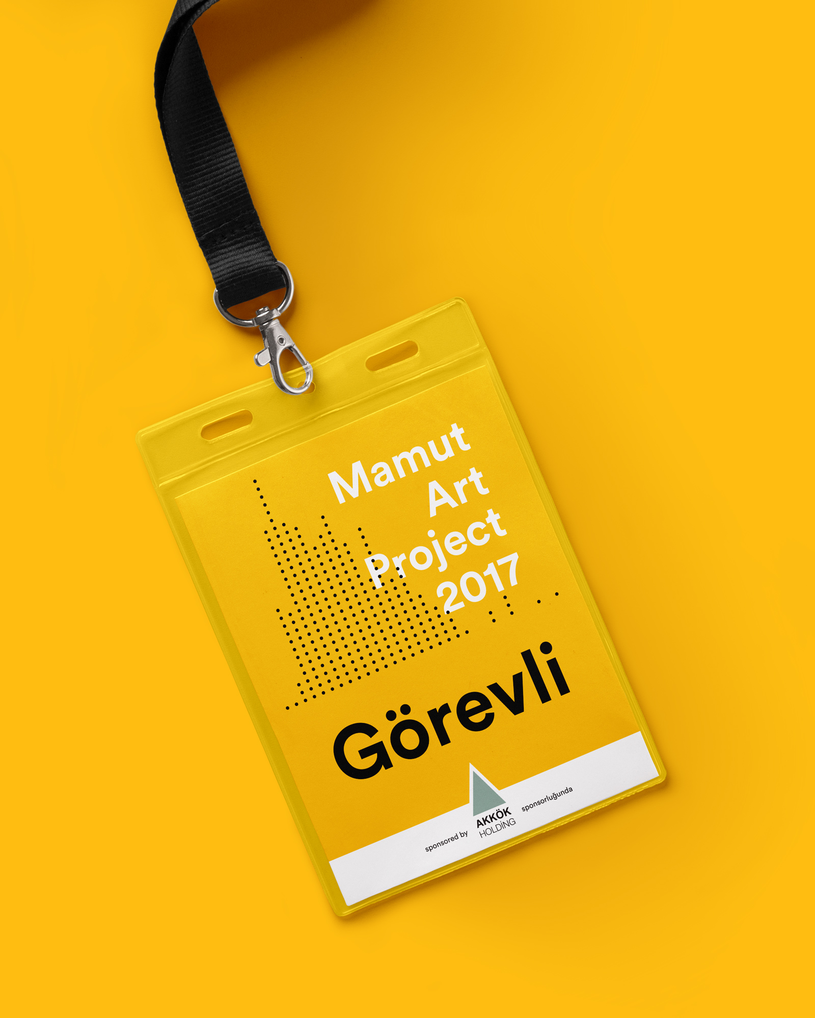
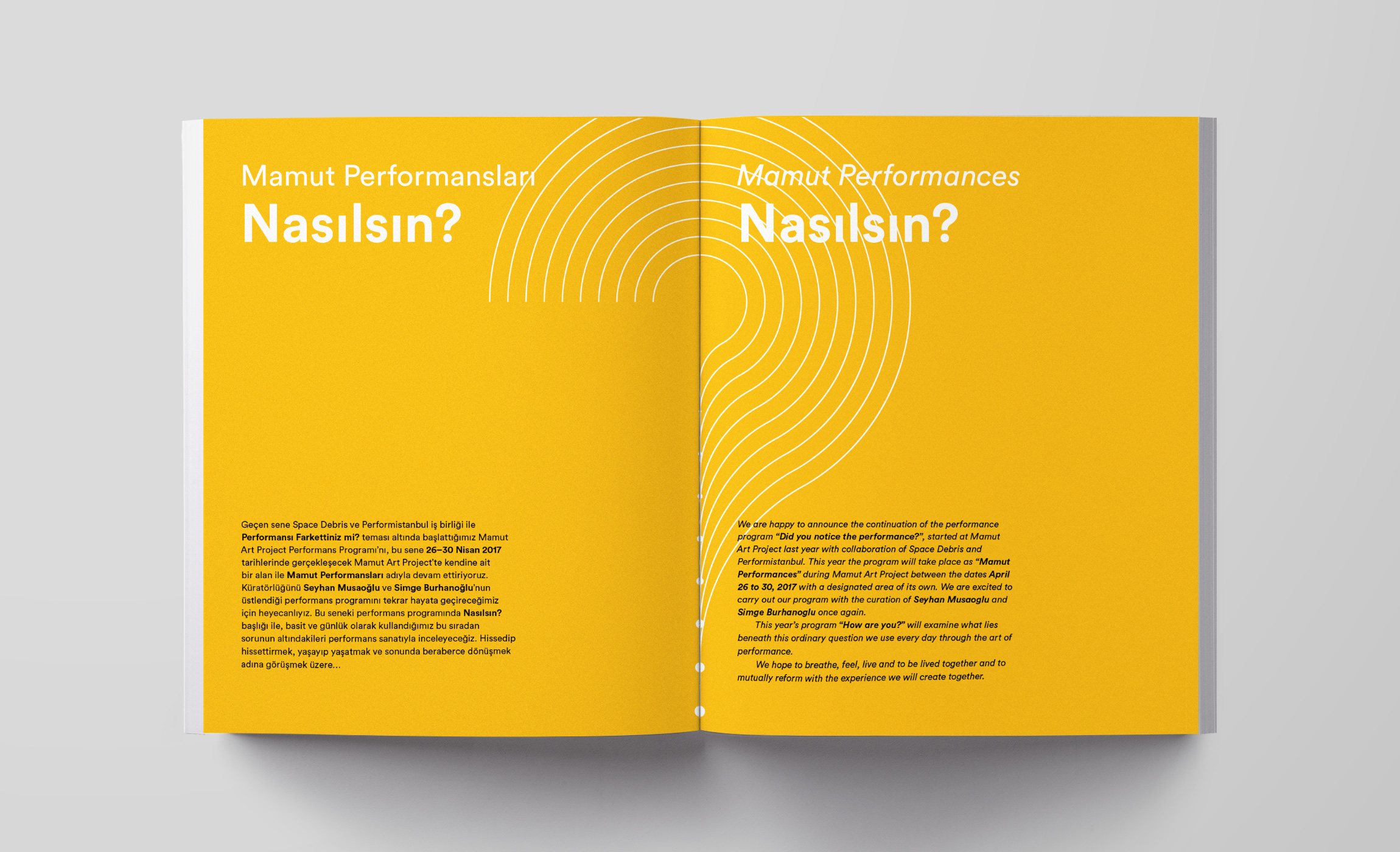
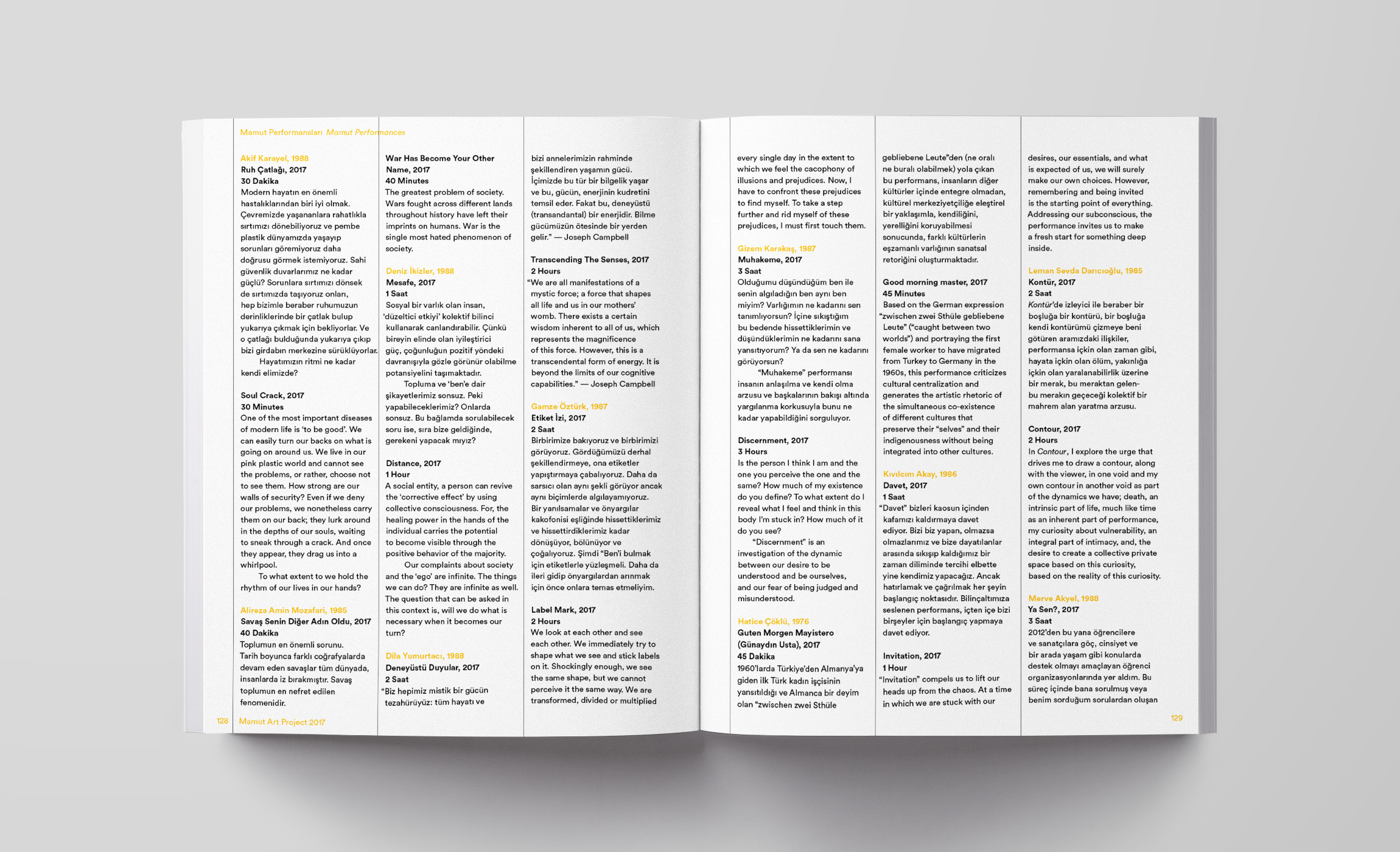
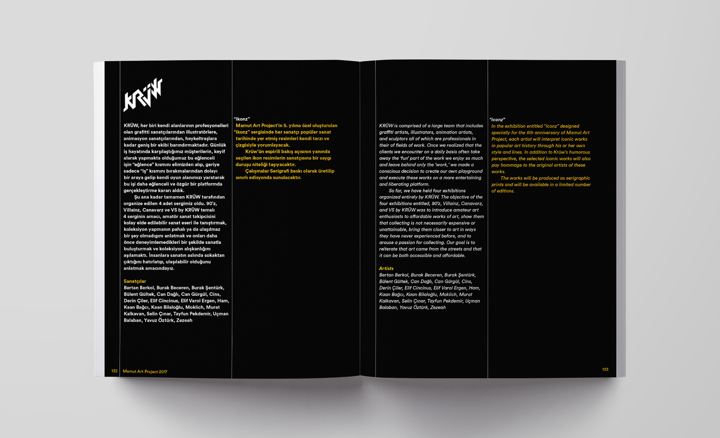
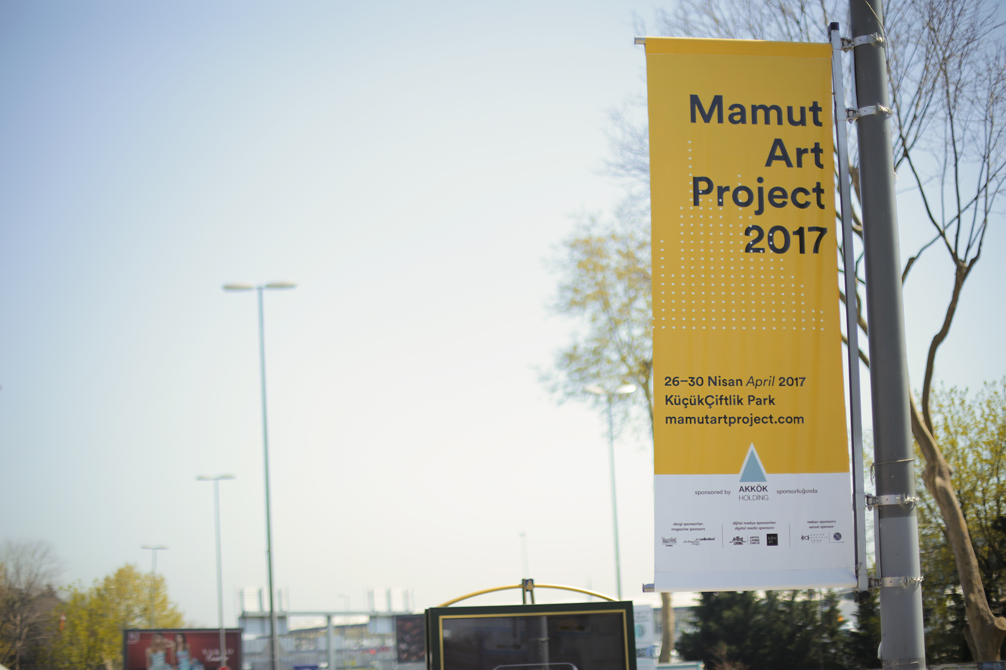
This minimalistic graphic language featuring the data visualizations acts as the unifying identity spilling over every single item, from the posters to the catalog, from the invitation to the venue graphics.
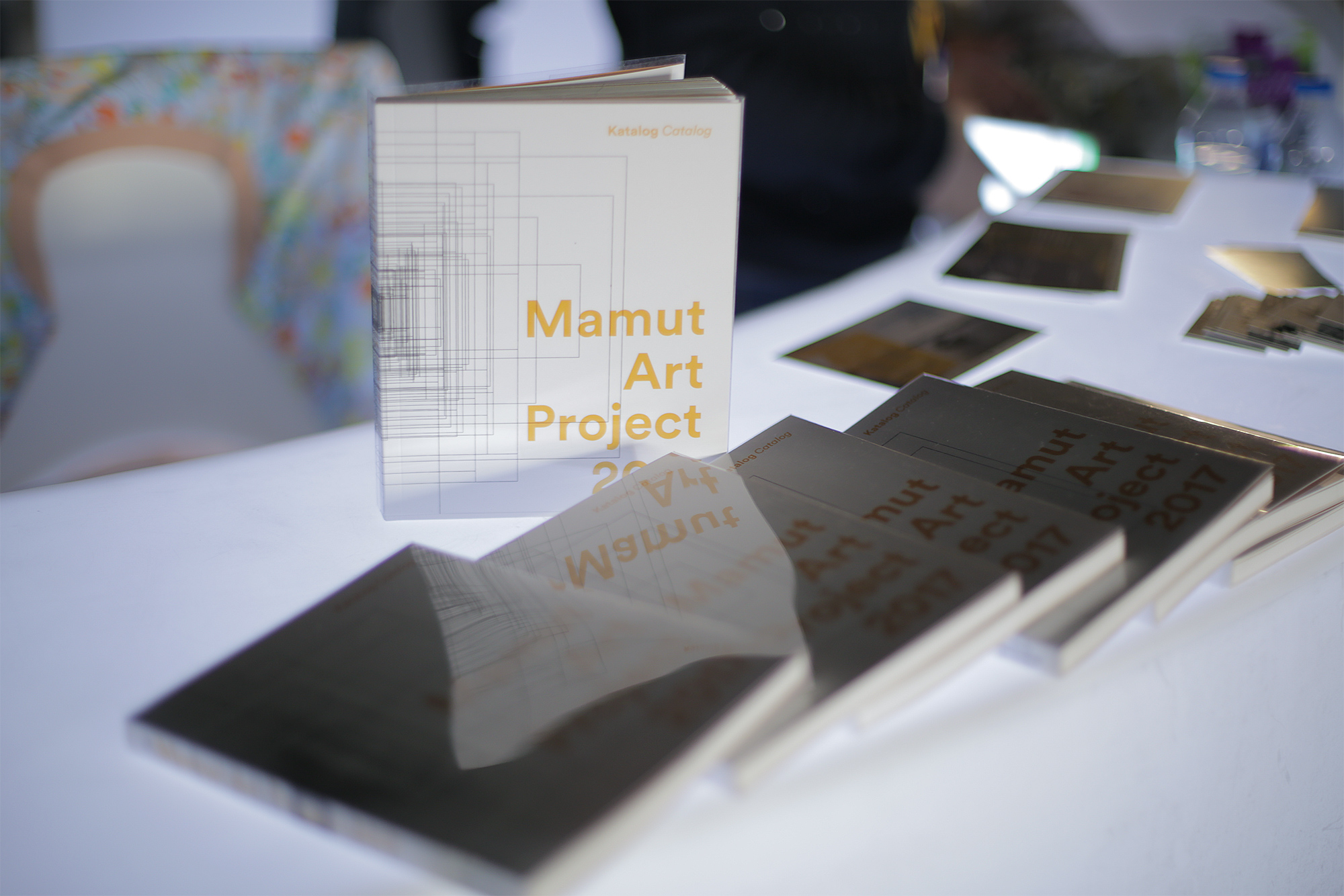
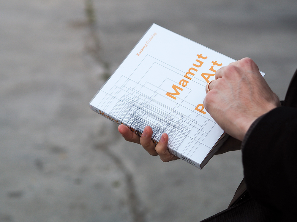
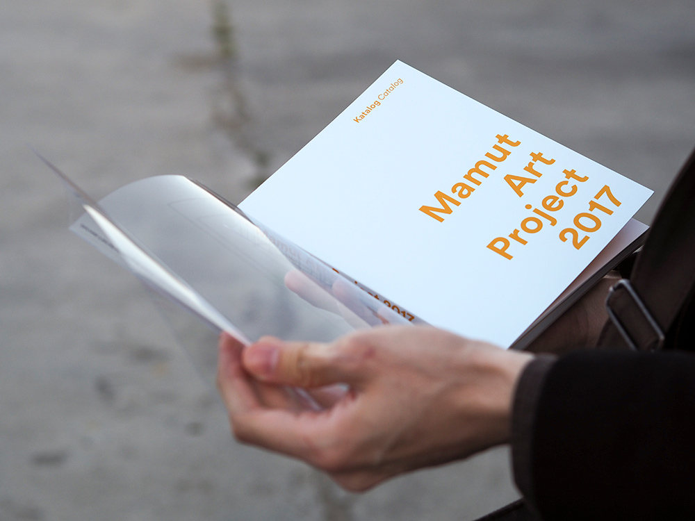
For the catalog cover we used a PVC (polyvinyl chloride) jacket with one of our visualizations printed on it, echoing the layering effect between the graphics and the typography seen on the posters.
WORDS FROM
SEREN KOHEN OJALVO, FOUNDING DIRECTOR
It’s priceless to know that you can leave a crucial part of your project in their hands without looking back, knowing it will be thought through to the smallest detail and done in the best way. Fevkalade is a team that sees themselves as part of your project and takes care of it as much as you do.
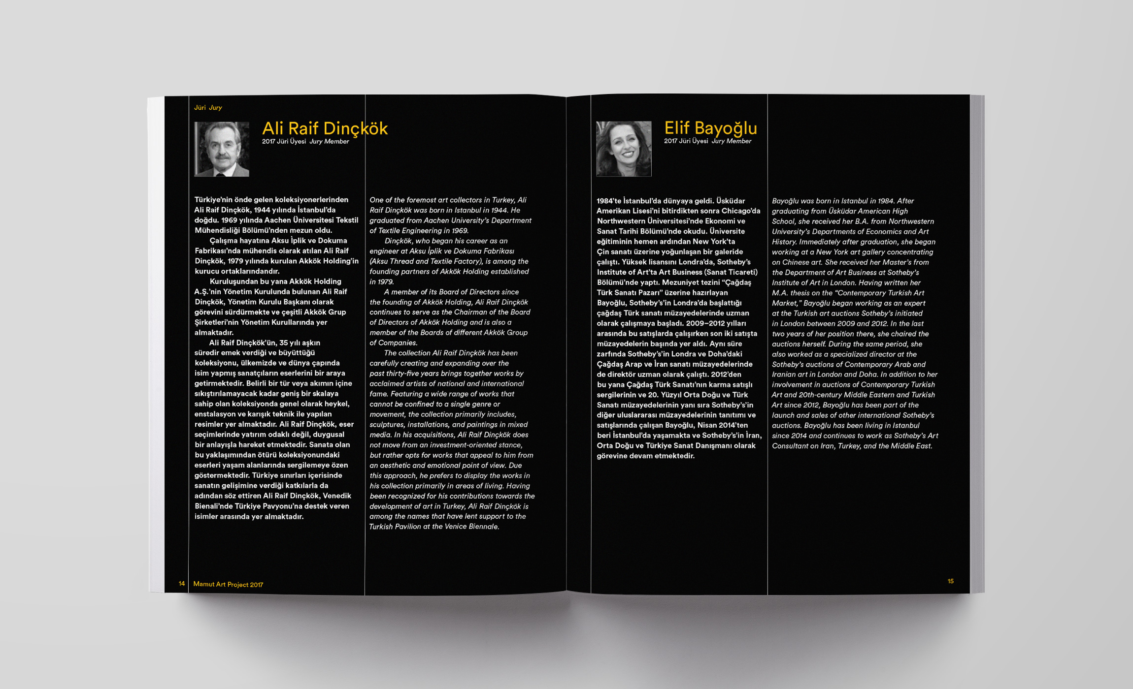
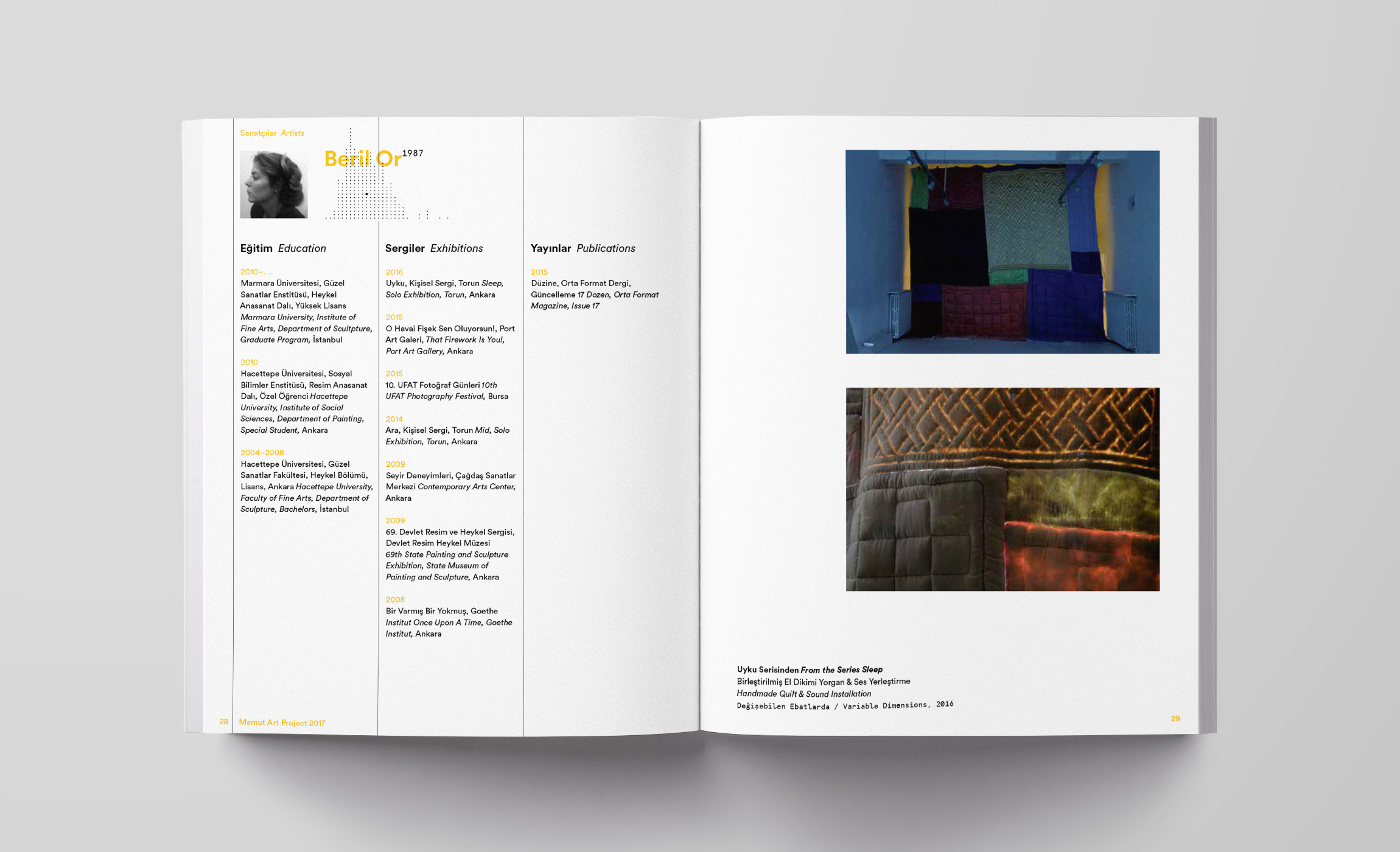
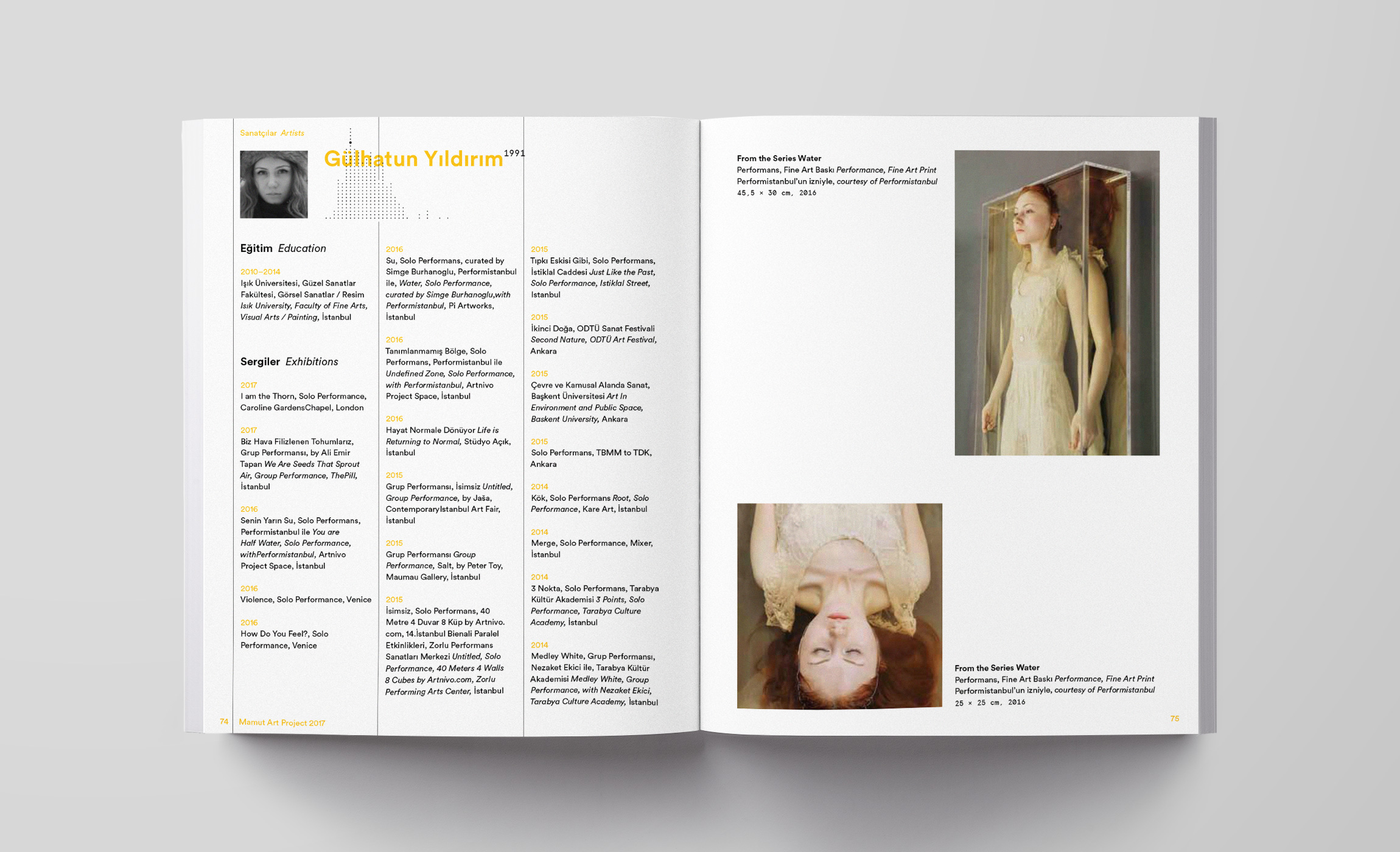
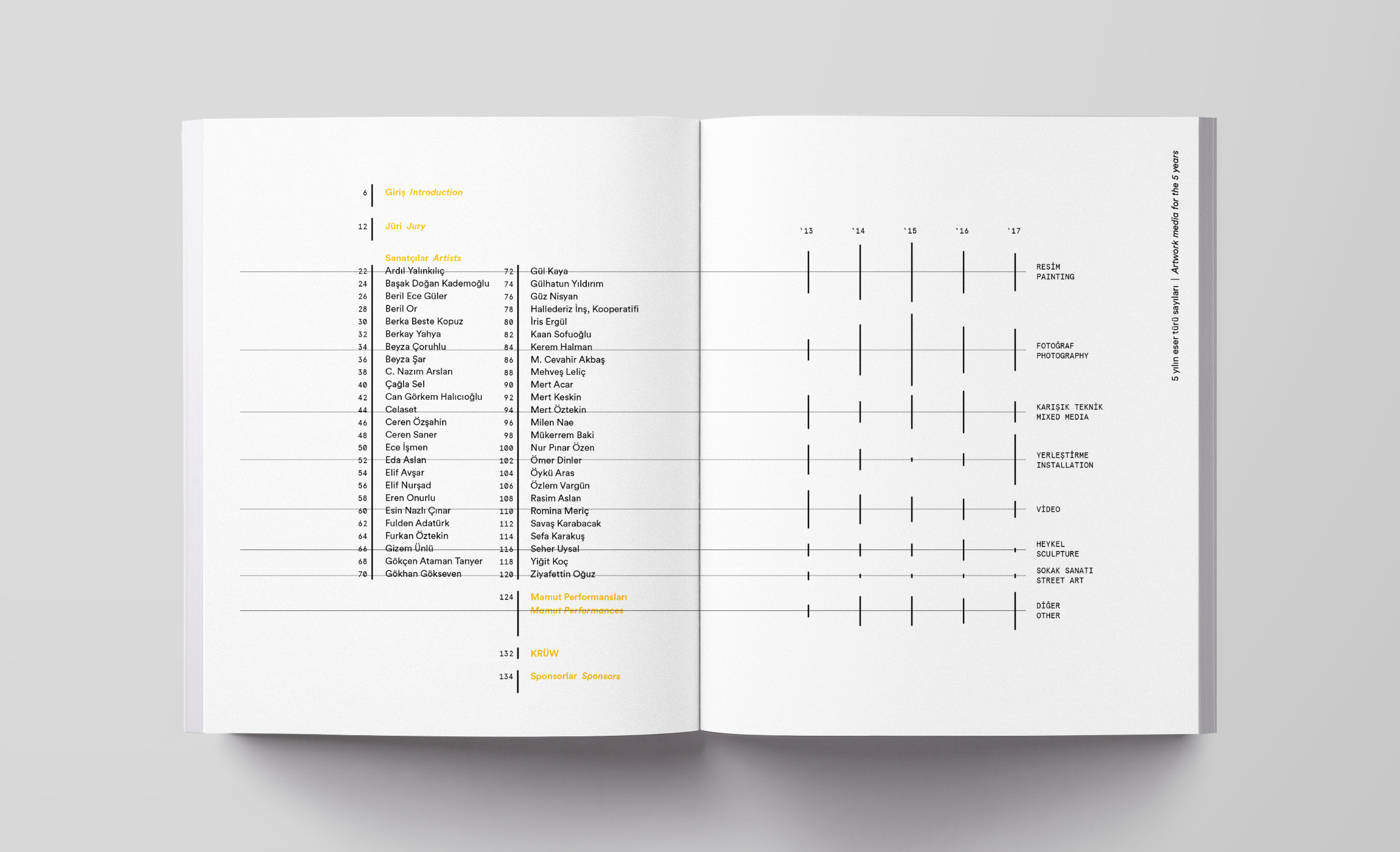
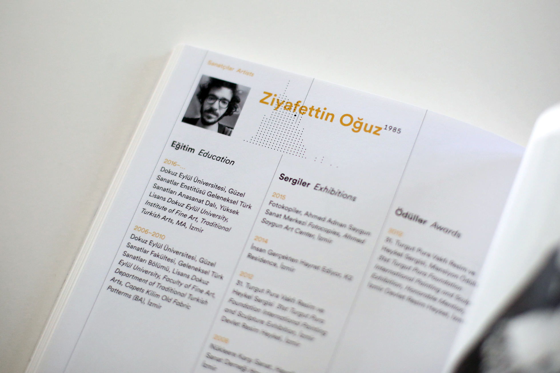
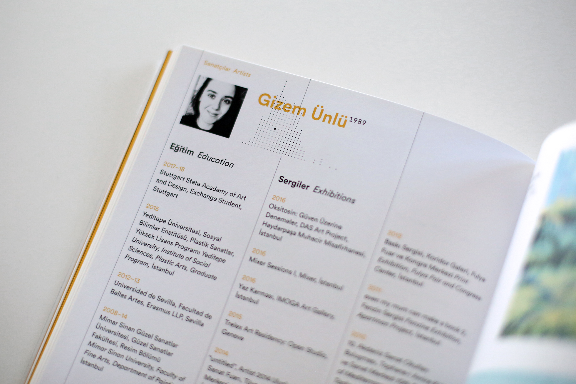
Each artist profile in the catalog has a customized graphic intersecting with the name, showing the position of that artist in the age distribution graph – another Easter egg for careful readers.
Some of the graphics were more heavily used on many different media, and some of them could only be seen in the catalog or the venue – a way of staying interesting and of engaging people.
In retrospect, creating a visual identity out of semi-abstract data graphics was a risky move. And risky moves don’t get to fruition without brave partners like Mamut Art Project.
We believe in a rational design process where decisions are based on objective reasons that emerge from the project brief and that can be articulated in meaningful and productive discussions.
More about us & our approach →
To discuss a project or collaboration feel free to get in touch.
fevkalade[at]fevkalade.net
All work © 2024 Fevkalade.