Client
Arter
Industry
Arts
Services
Poster Design, Editorial Design
Year
2016
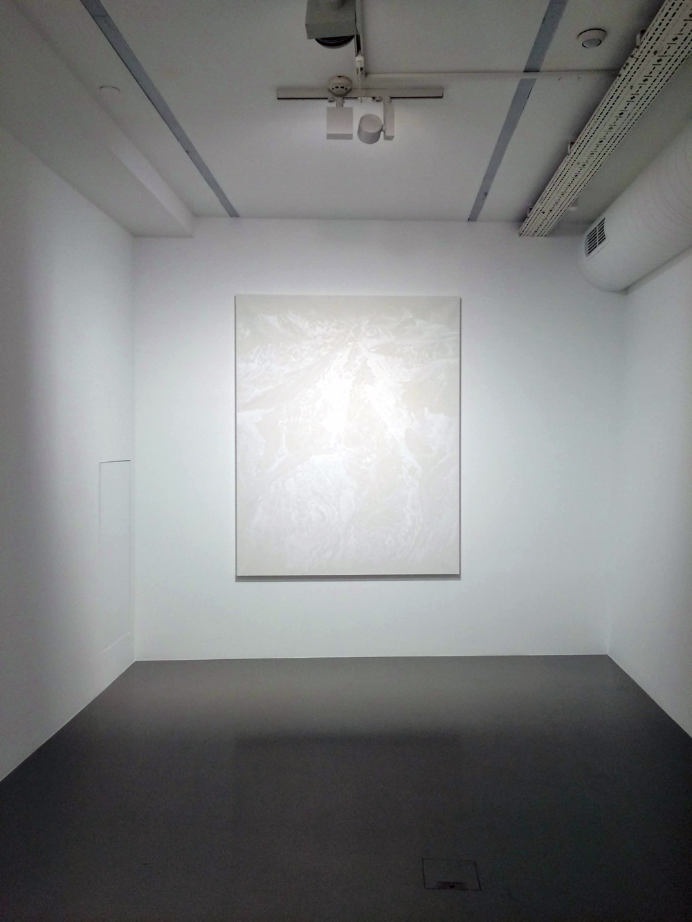
Murat Akagündüz’s exhibition Vertigo brings together 13 paintings from the “Kaf” series. In this new series the artist depicts some of world’s highest mountain peaks as seen on Google Earth.
How is the act of painting transformed once we rely upon the mediation of digital data to depict an actual physical landscape? The exhibition thus refers to the ontological consequences of such digital mediation in our relationship to the Earth and its implications in terms of vision and image production.

Photo: Ali Taptık
The “Kaf” series, in its search for a language using different shades of white, winnows down the minimal conditions of pictorial representation to a bare-bones relationship between light and shade and approaches the threshold of visual perception. As the horizon is nowhere to be found, our sense of being grounded in space is unsettled and a sense of vertigo sets in. By opening up a space for silent contemplation, the paintings invite the viewer to sense the new possibilities found in this loss of ground and thus produce a new perception of the world.
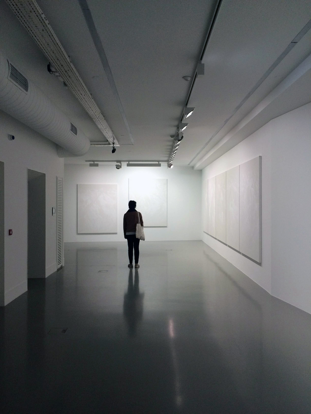
With an exclusive preview guided by Akagündüz in his workshop, we got the chance to experience these huge white-on-white paintings ourselves and to learn about the artist’s perspective. This head start gave us a rich spectrum of ideas to try out.
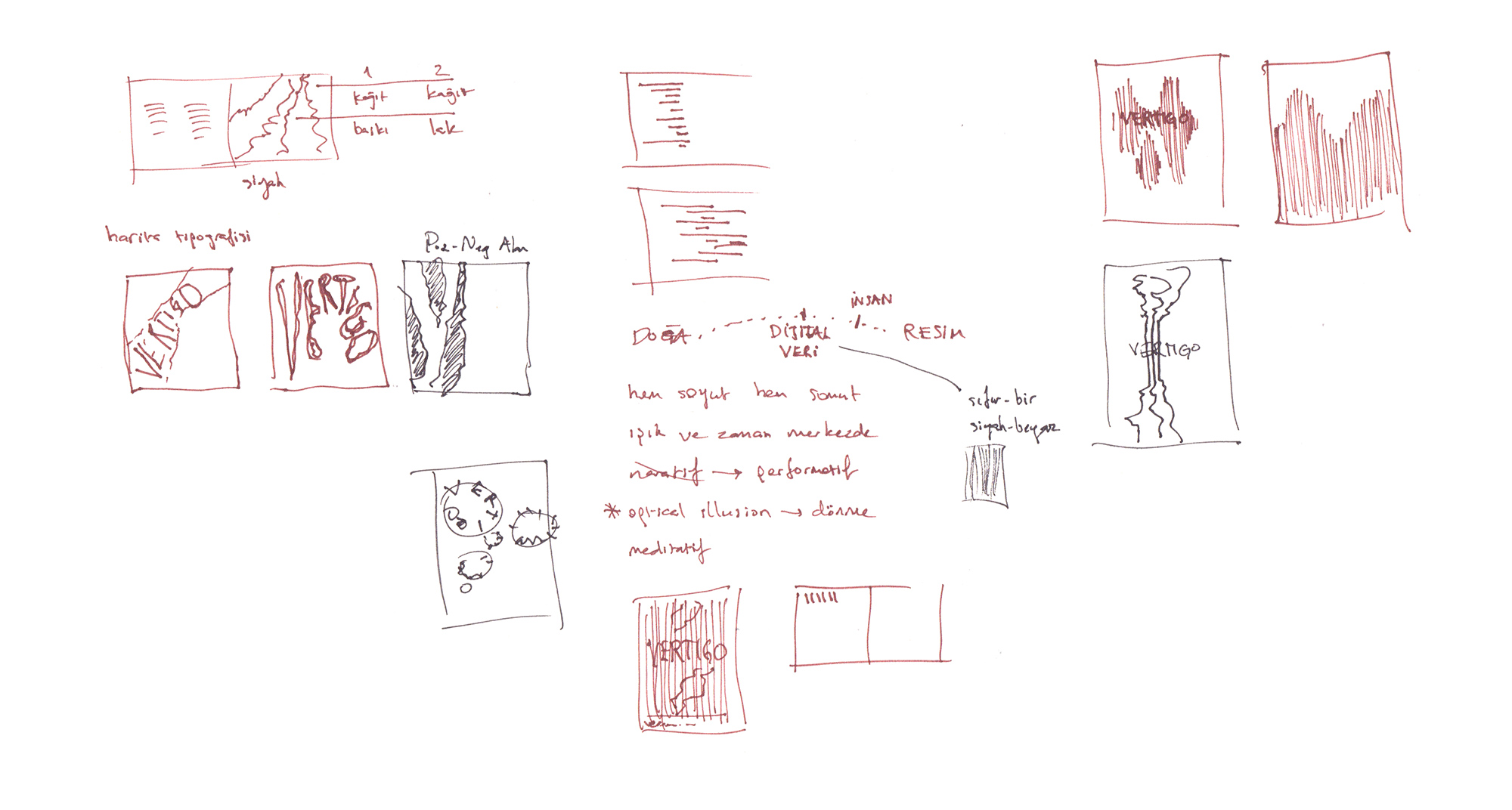
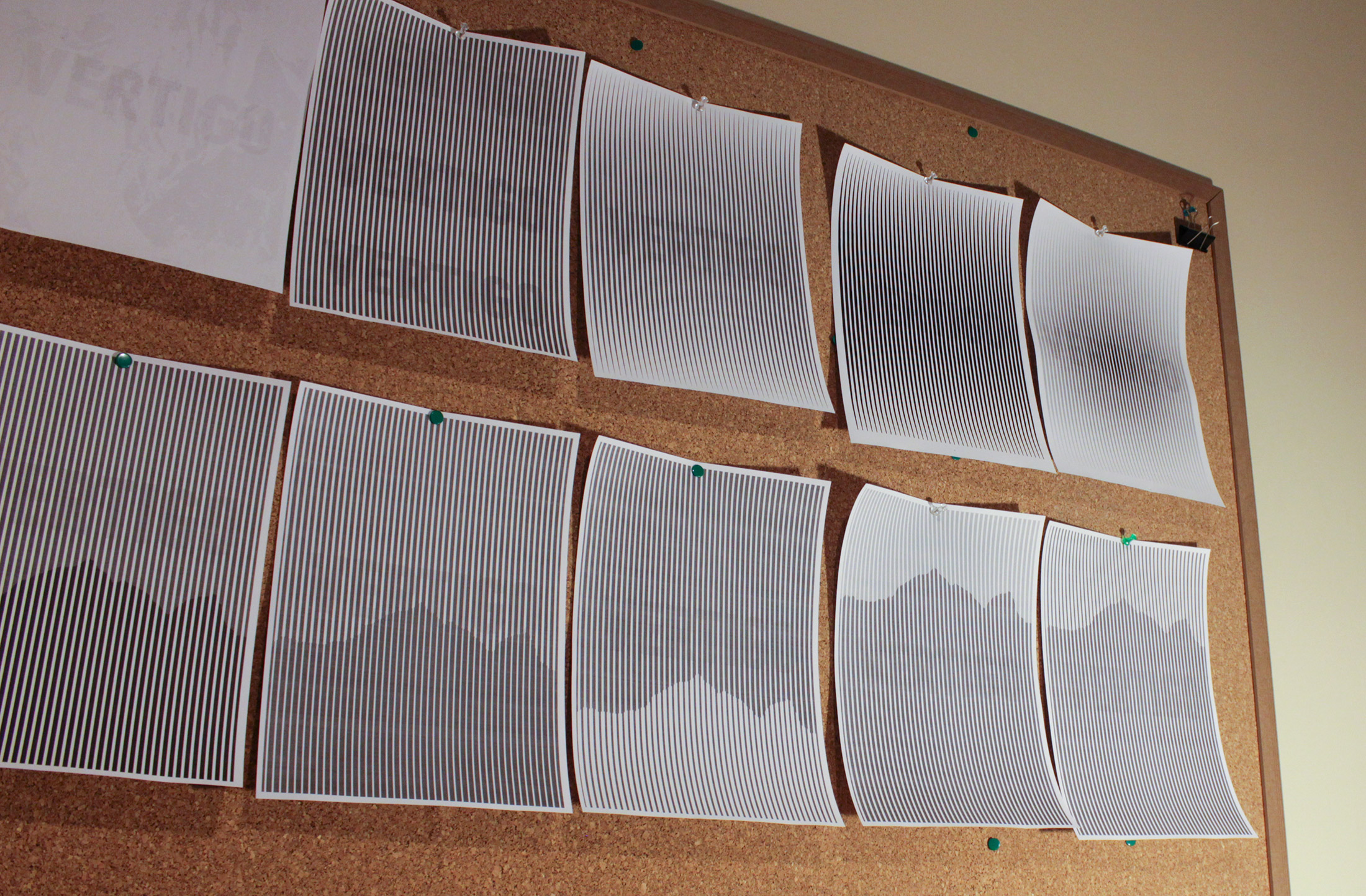
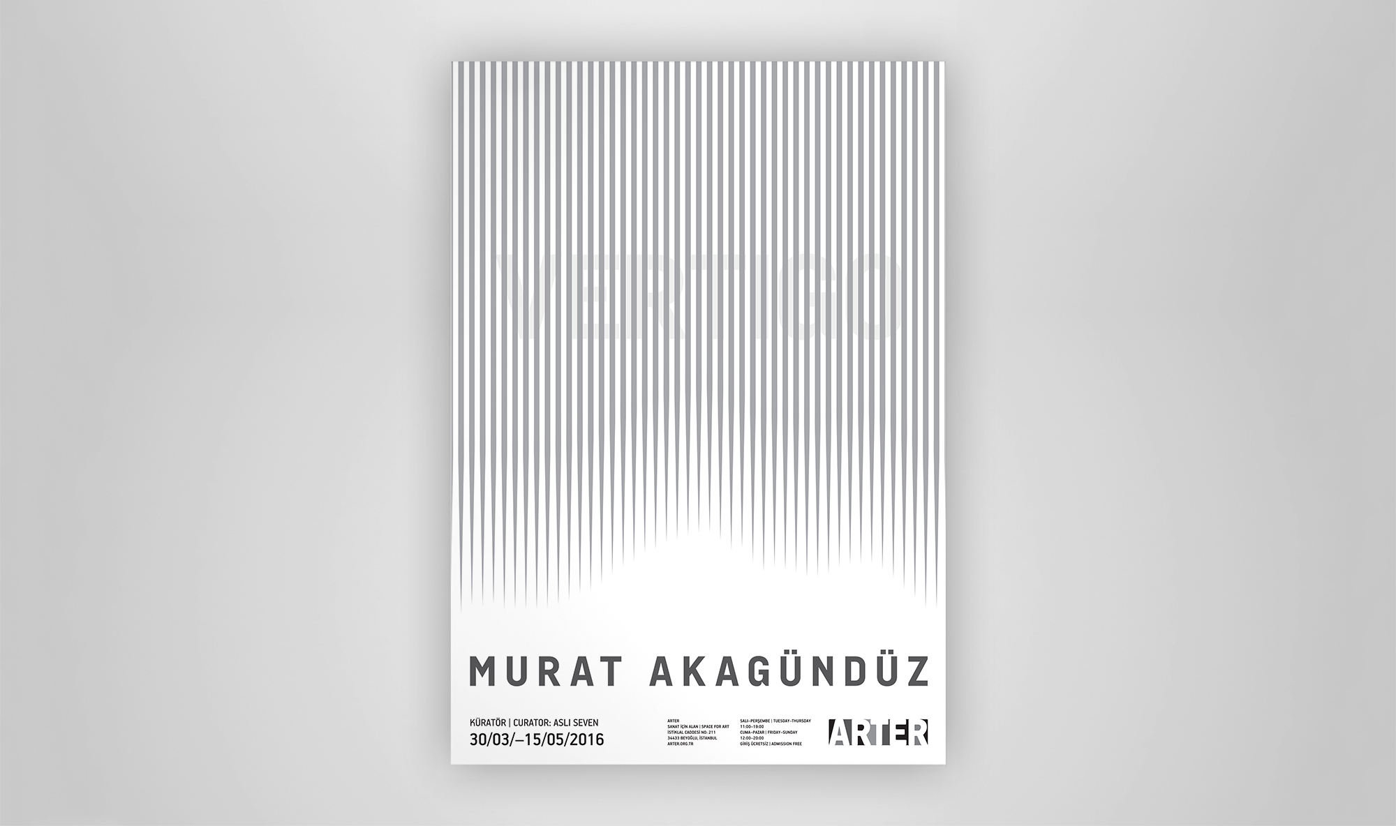
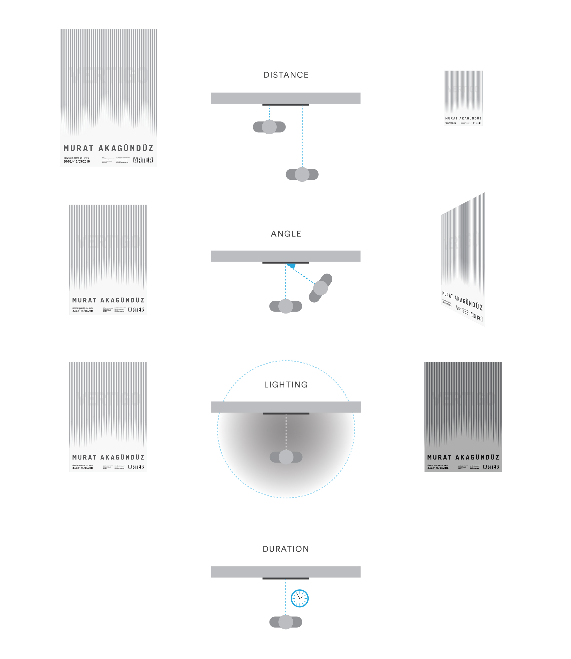
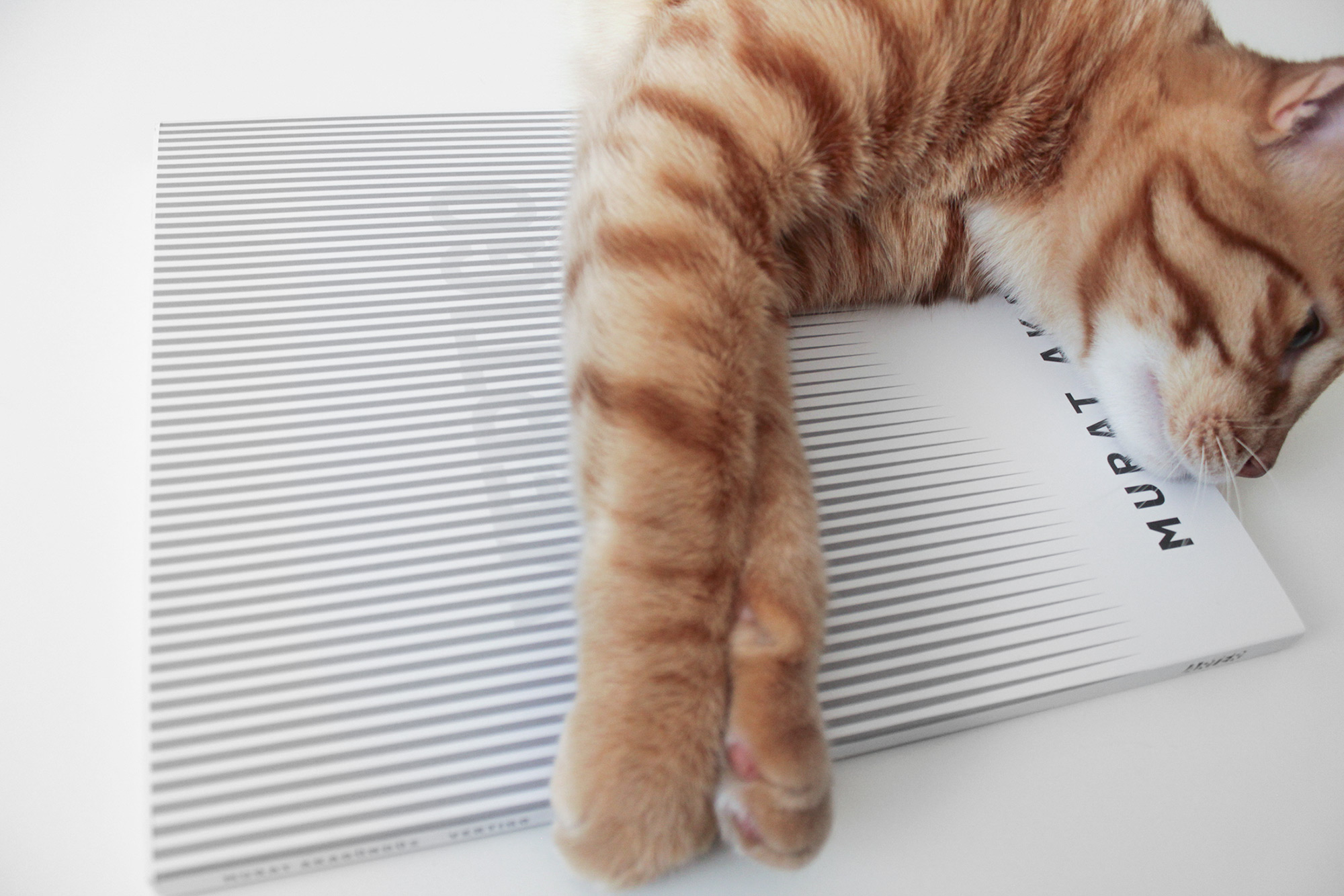
Revolving around concepts such as “performative, time, light, mediation, meditation, perception, vertigo” embedded in the “Kaf” series, we decided on incorporating an optical illusion. We worked like neuroscientists as we went through dozens of alternatives and print-outs with varying thickness/color/spacing values to optimize the effects of the illusion: The visibility of the title “Vertigo” changes according to parameters like distance, angle, lighting, and duration, just as the viewing experience of the paintings in the “Kaf” series does.
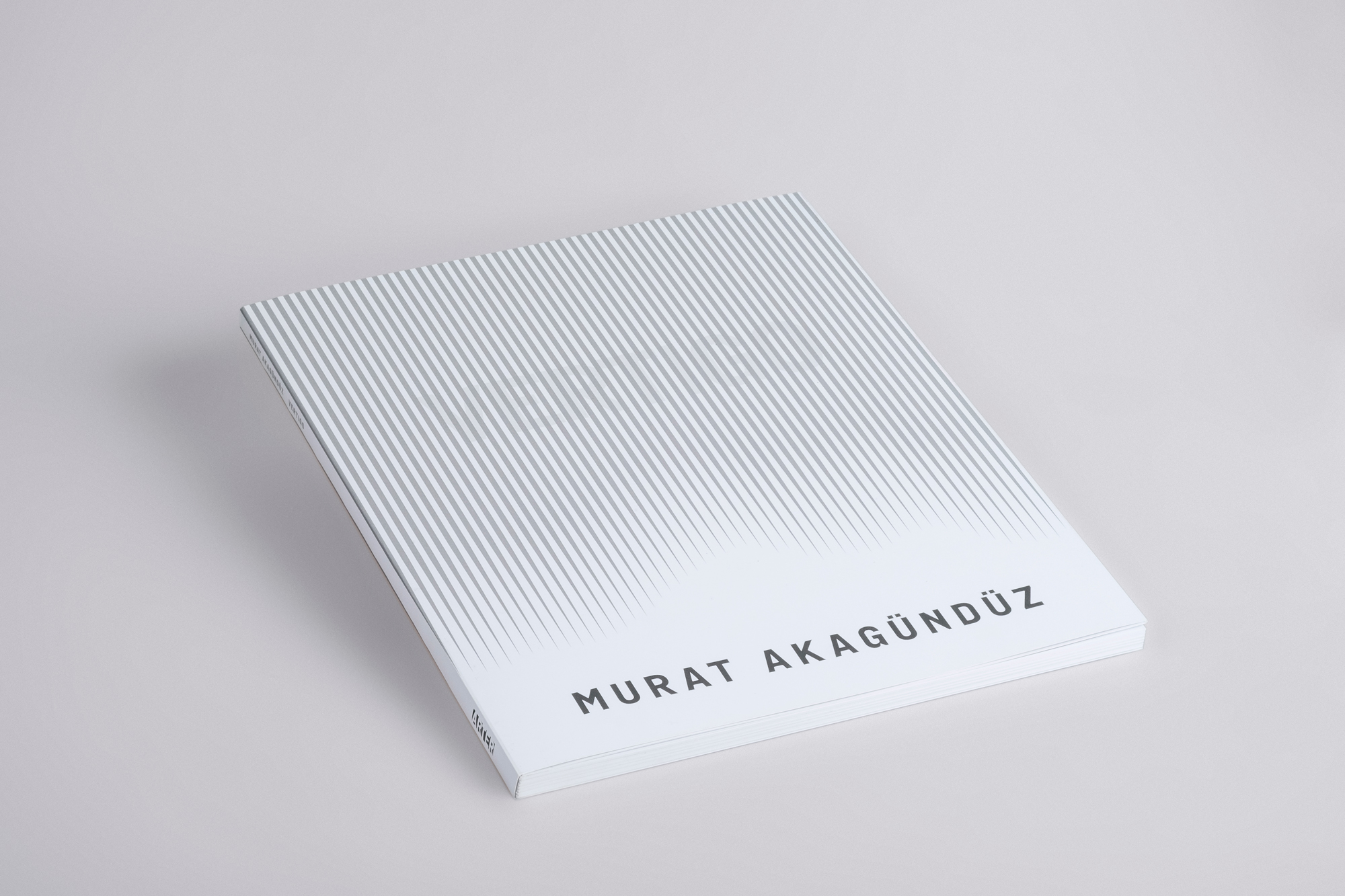
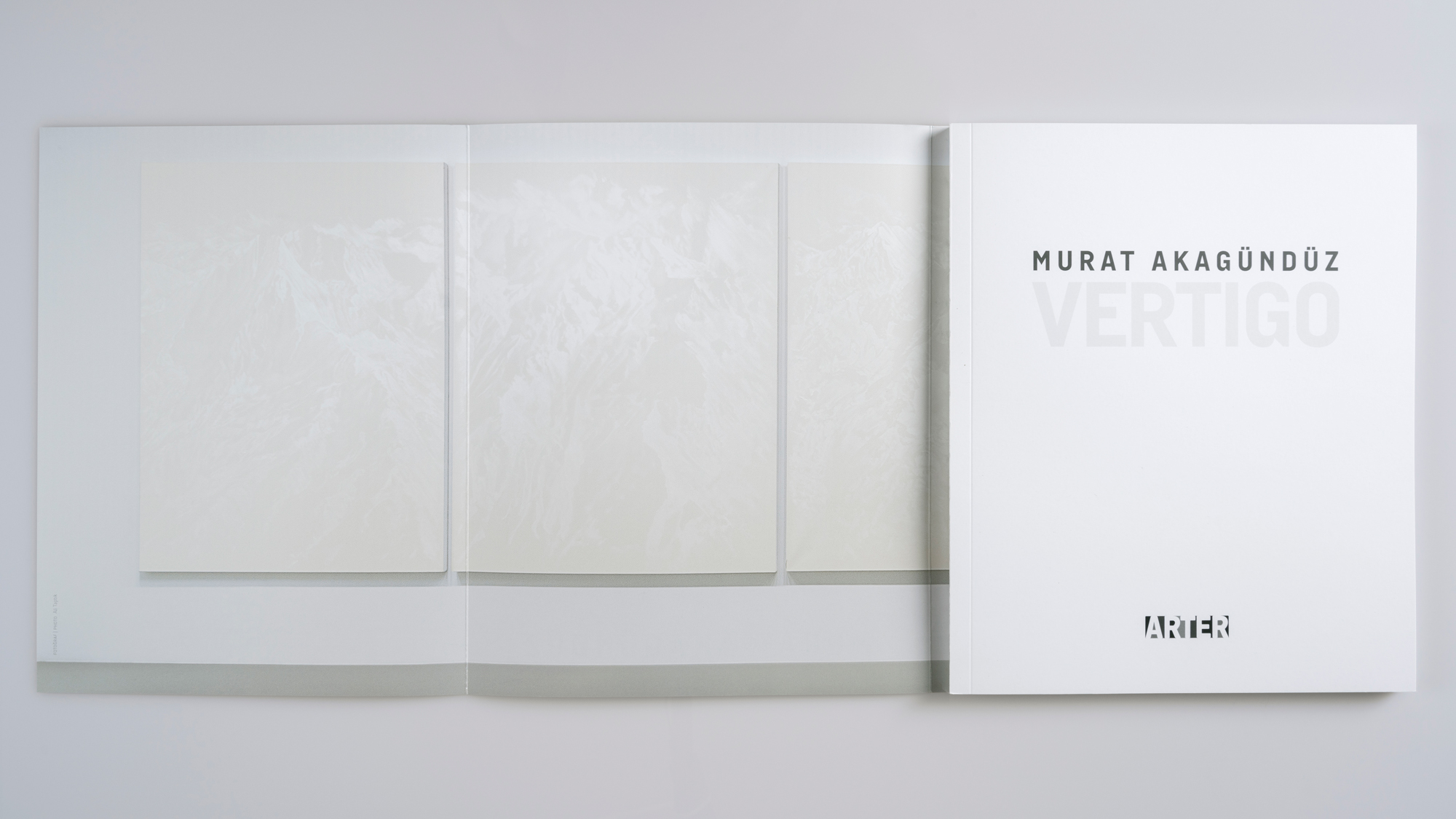
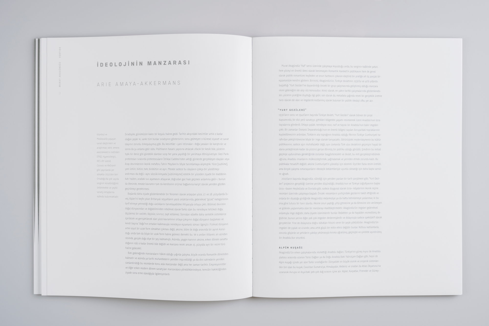
A large book size, a cool white paper, lots of white space, a cool gray color theme, generous line spaces... Our editorial design was based on our decision to emulate the sense of ethereality of the exhibition and to do justice to the meditative qualities of the artwork.
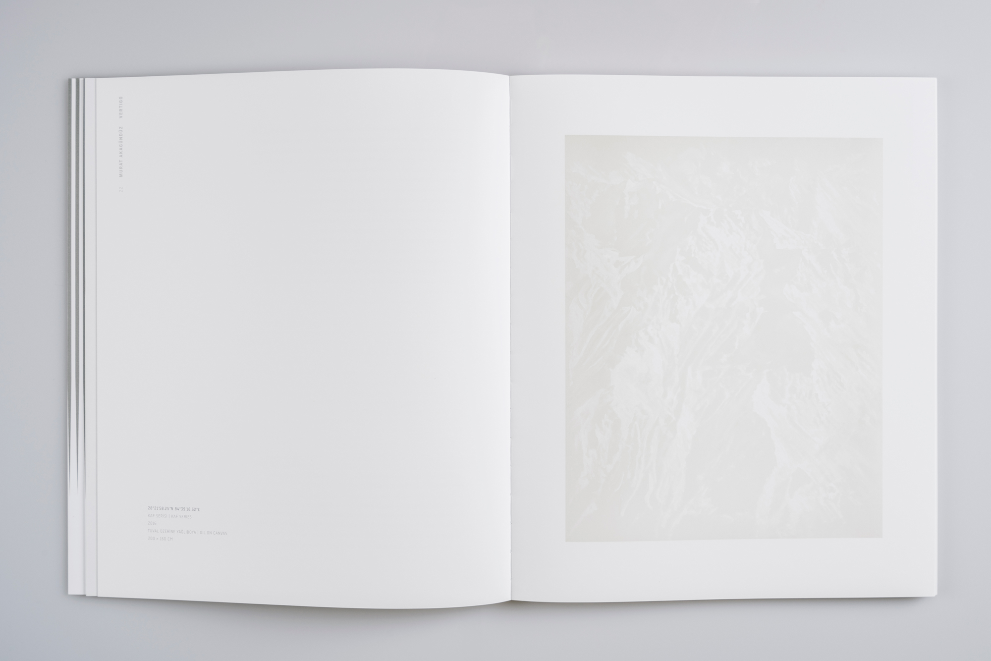
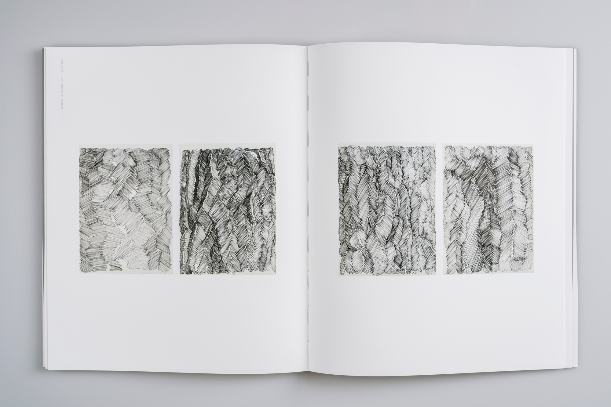
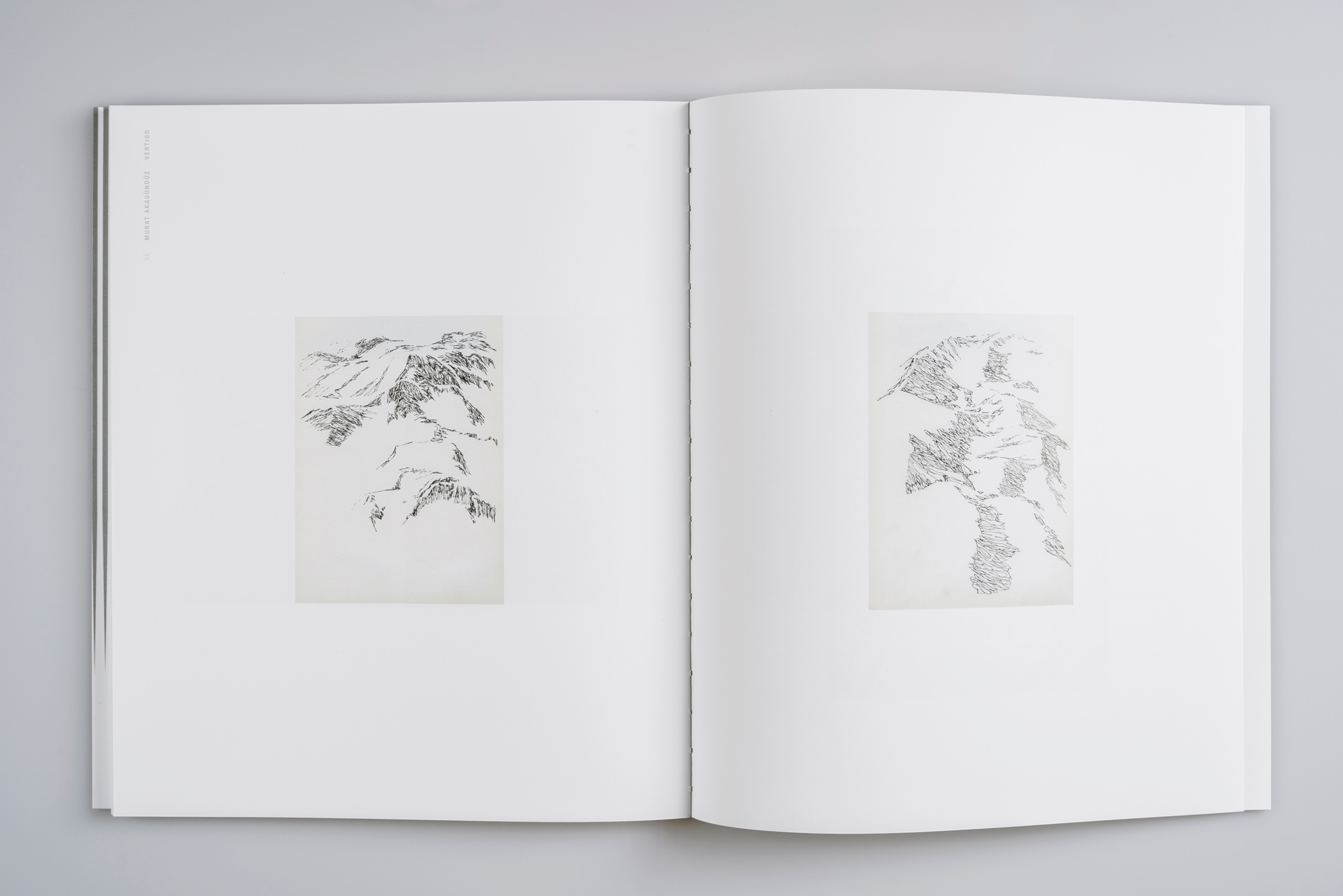
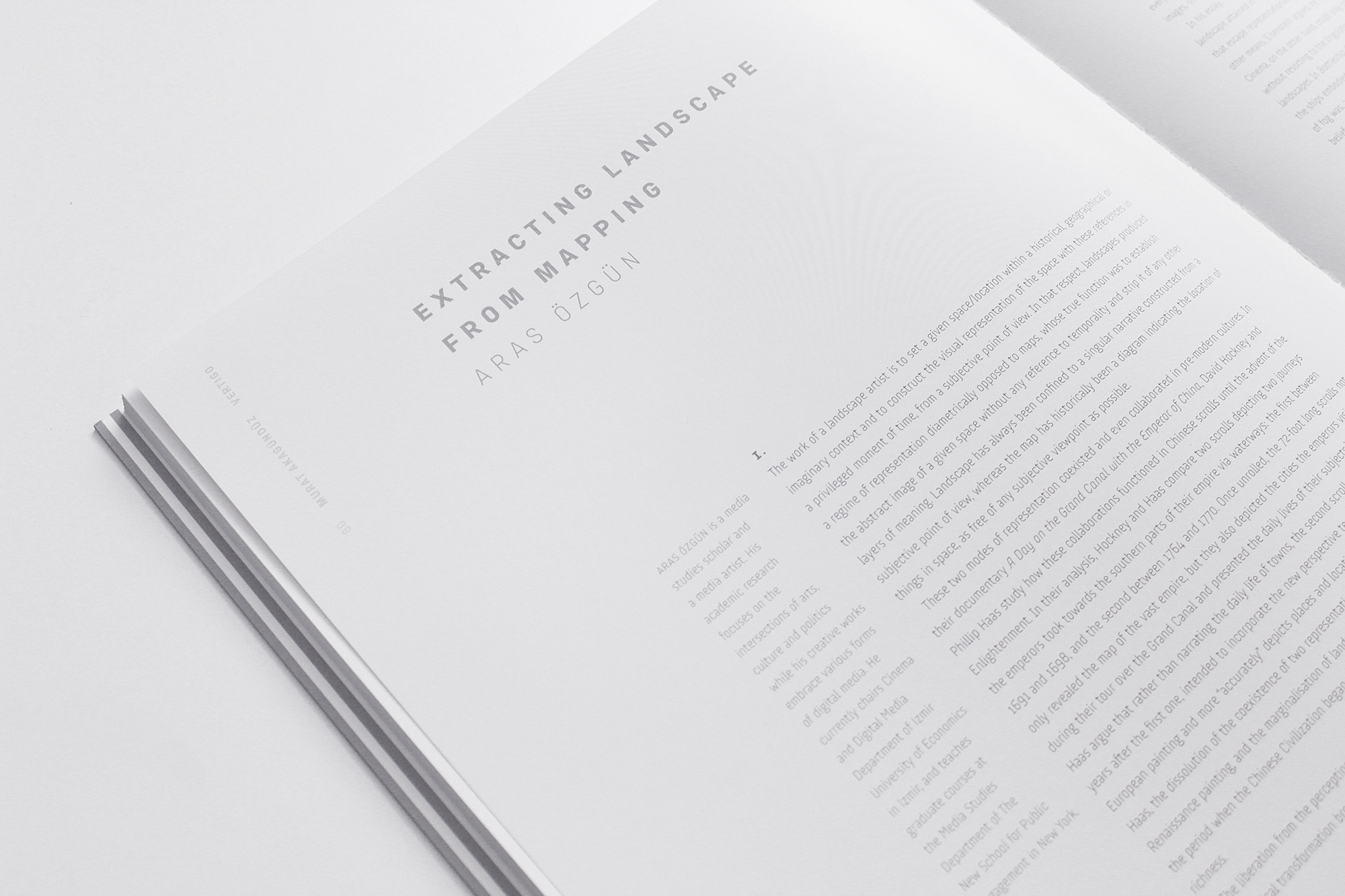
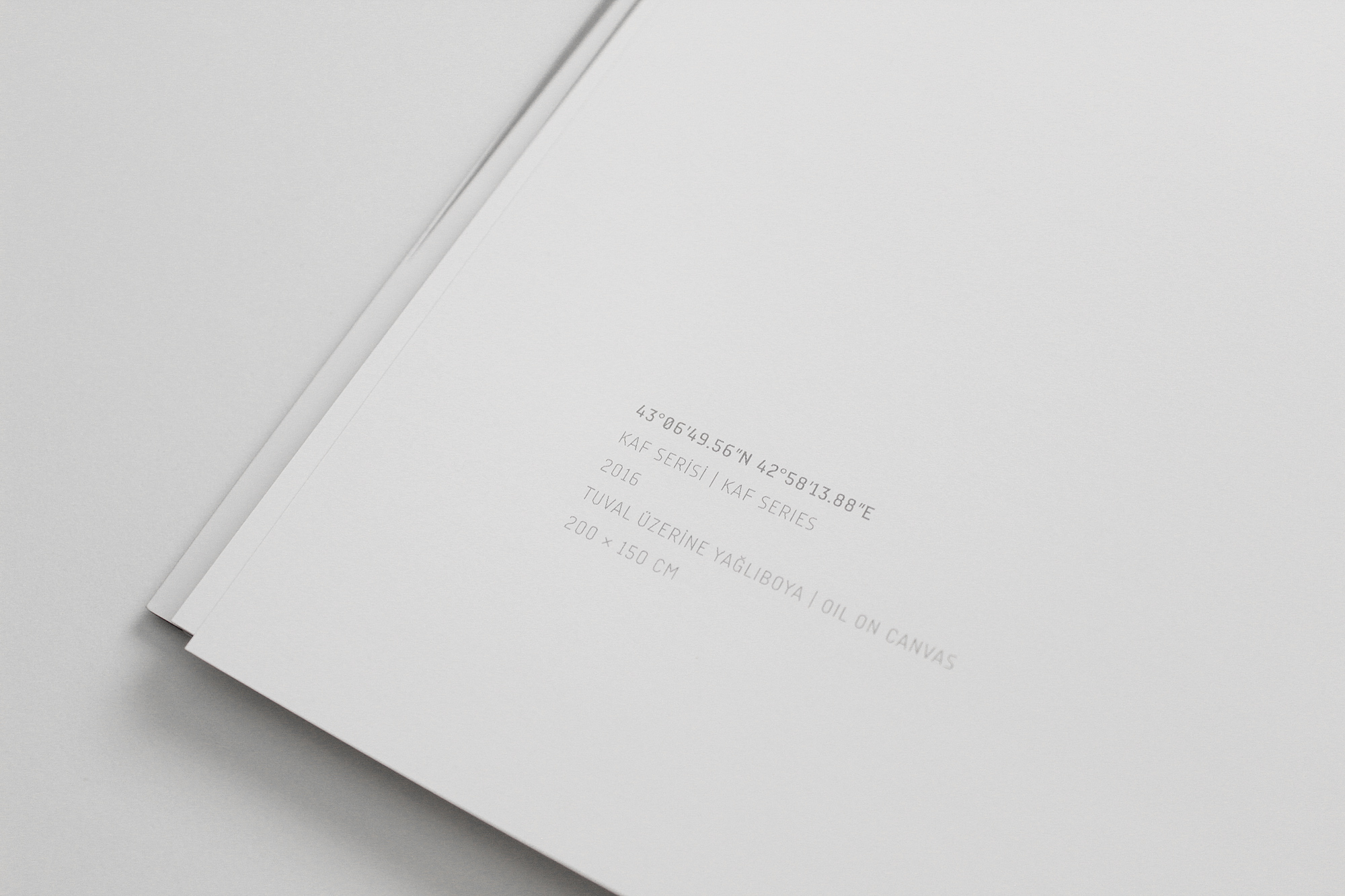
Each painting in the “Kaf” series takes its title from the latitude and longitude values defining the position of the images on Google Earth. This made the design of the figures an important factor in our typeface choice – and the eerily digital story of these paintings was a reason why we went for a typeface that has connotations of a digital and mechanic aesthetic.
Designing for art always has its unique challenges. Constructing the conceptual and visual interactions between the artwork and the design (posters, books, etc.) presenting that artwork requires extra care. Moreover, the designer must be able to function within the complex social network comprised of artists, galleries, curators, editors, publishers, and the audience. In “Vertigo”, we believe the stars were aligned.
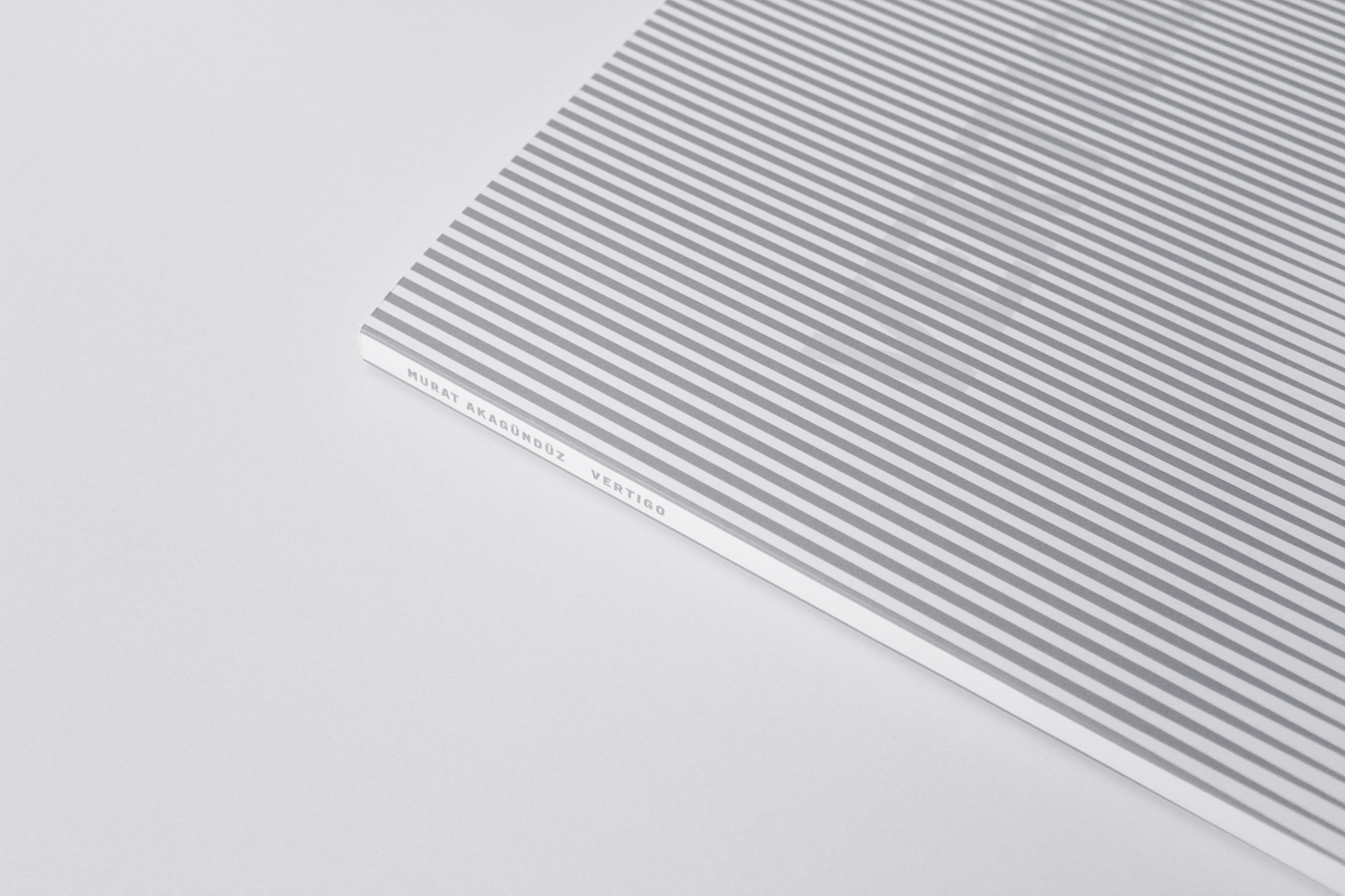
The photographs of the book (excluding the close-up photographs) are shot by Ali Taptık.
We believe in a rational design process where decisions are based on objective reasons that emerge from the project brief and that can be articulated in meaningful and productive discussions.
More about us & our approach →
To discuss a project or collaboration feel free to get in touch.
fevkalade[at]fevkalade.net
All work © 2024 Fevkalade.